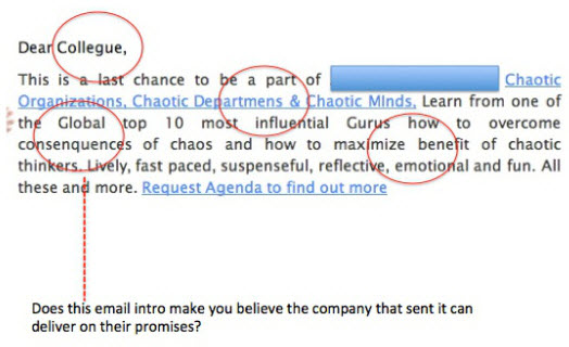
We’ve all seen ‘em. Emails that are so ugly, you ask yourself, “What were they thinking?” Nobody wants to send an ugly email, but it happens.
To avoid major email eyesores, here’s a list of flaws or faux pas you should avoid when creating your emails.
1. An email template that isn’t mobile-friendly
Sending an email that doesn’t render properly on a smartphone or tablet can be a waste of time for both the sender, as well as the reader. It’s frustrating for a reader to shift from vertical to horizontal while simultaneously pinching the screen to zoom in. After that experience, an impression of a sender’s business can be less than positive.
Hint: VerticalResponse email templates are fully-responsive so they look great on any device.
We also have more mobile-friendly design tips in this recent post.
2. Typos or grammatical errors
It’s always a turn off to see a perfectly good email marred by a misspelling. If caught, it’s a definite distraction to what you really want to convey in your message. It’s always a good idea to send a test message to yourself as well as someone else. Getting a second pair of eyes on your email can help you catch any of those unwelcome typos.

3. Font style overload
Using several or even a few different font styles within the same email can be overwhelming to a reader. Only use on or maybe two different fonts in your email to keep it looking clean and consistent.
4. Color explosion
Using a rainbow of color choices in an email can be jarring to the reader. Whether it’s the color for your text or the background color, you should select colors that match your brand’s image. If you need to use multiple colors, make sure they complement each other. For more info, learn about the psychology of colors.
5. Too much going on syndrome
In order to understand the main message or call to action, overly busy emails cause a reader’s eyes to dart back and forth across the screen. This will not get you the results you are looking for. More does not necessarily mean better.
Look at the example below and count how many calls to action and varying messages there are in this one email. There’s definitely too much going on here.
If you’re sending a promo, stick to one effective call to action, and make it very prominent. If you’re sending an email newsletter, divide content into clear, clean sections. Guide a reader’s eyes down one path, not fifty.

6. A buried call to action button
Most emails (should) have a call to action. Examples include: “Buy Now,” “Learn More,” “Donate Today,” etc. Don’t make your readers hunt for it. Include a call to action button that’s prominent and eye-catching.
In the email example below, the calls to action are hard to find. Why? Because they’re text-only, and they’re written in the same font and color as the rest of the text. The call to action, “Shop June Hitlist” blends in too much with the other copy to even get noticed.

7. Missing pre-header text
Pre-header text serves as a secondary subject line and it grabs a reader’s attention amongst other emails in a crowded inbox. If you’re not using pre-header text, add it to all of your emails now – It’s typically the first line of text found at the top of your email.
Below is a good example of using pre-header text:
![]()

8. Imagery gone wild
Images are an important component to any email. We all know a picture is worth a thousand words. However, there’s no need to throw in a bunch of irrelevant images into an email. Any images should relate directly to the product, service or information the sender is trying to convey. Reference this article, which outlines the specifics of using images in emails.
9. A subject line that doesn’t align
Trying to trick a reader into opening an email with a subject line that doesn’t match the content of the email is just plain shady. Readers will be more hesitant to open any emails from that sender in the future. And, this kind of trickery is against the CAN-SPAM law, the Canadian CASL law and European laws, so just don’t do it.
P.s. Don’t USE ALL CAPS in a subject line either. It looks like you’re shouting. Highlighting one important word with all caps can be very attention-getting though, so don’t rule this technique out completely.
10. One big block of text
An email does not need to be a dissertation, or even a large paragraph. Enough said.
Email design eyesores can be easily avoided with the right font and color choices, a prominent call to action, the perfect mix of text, images and white space, and it never hurts to get a second opinion. Did we miss anything that gets to you? Let us know in the comments.
For more tips, check out our free email design guide.
This article was syndicated from Business 2 Community: Top 10 Email Eyesores You Should Avoid
More Digital & Social articles from Business 2 Community:


