Normally a brand unveiling a new visual identity is important news only to the brand’s employees, their families, and their friends. But when Google changes its visual identity, the whole world responds.
As announced on Google’s corporate blog, the media giant has unveiled a new visual identity, including a new logo, triggering news coverage from media such as CNN and Fast Company. I believe the change is important for a couple of reasons. First, Google is acknowledging the rise of the mobile consumer. And second, the new visual identity system is a bold swipe at Apple.
The Supremacy of Mobile
As Google noted in a blog post, the company has revised its visual identity to reflect the reality that the desktop no longer dominates as the principal way people use Google. As Google noted:
Once upon a time, Google was one destination that you reached from one device: a desktop PC. These days, people interact with Google products across many different platforms, apps and devices—sometimes all in a single day. You expect Google to help you whenever and wherever you need it, whether it’s on your mobile phone, TV, watch, the dashboard in your car, and yes, even a desktop!
Indeed, mobile searches on Google surpassed desktop searches. And Google needs to adapt to the way people encounter its brand on their mobile devices, just as Google has compelled other brands to do the same via its “Mobilegeddon” algorithm update. So Google has made its wordmark more colorful and removed the serifs from its name, making the Google brand a more visually attractive experience regardless of what platform you use.
As Jacob Kastrenakes of The Verge notes,
Making the logo look good on small screens seems to have been a major consideration. The new, simpler lettering is supposed to scale better to smaller sizes, making the wordmark more distinct and easier to read. It’s also supposed to be easier for Google to display on low-bandwidth connections: Google says that it’s made a version of its logo that’s “only 305 bytes, compared to our existing logo at ~14,000 bytes.” Given that one of new Google CEO Sundar Pichai’s big goals is to bring the internet — and Google, of course — to areas of the globe that don’t already have it, that small difference is definitely going to be an important one.
We’re Coming for You, Apple
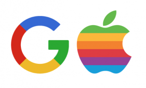
Google is also changing the tiny “g” logo that you see on browser tabs. It’s now going to be an uppercase “G” that’s striped in all four of Google’s colors. In the Alphabet portfolio, “G” is for Google. The new multi-colored “G” icon makes use of Google’s color palette and an increased visual weight to support small sizes — such as an app icon. While the shape of the “G” might be new, the color and proportions make it unmistakably Google — and likely an icon for the brand that could hold its own against the iconic Apple logo. Moreover, the multi-colored G has an unmistakable resemblance to the previous version of the Apple logo.
Google is sending a not-so-subtle message to Apple that Google is as influential, user-friendly, and design savvy as Apple is. For instance, the Google logo includes a colorful Google mic help you identify and interact with Google whether you’re talking, tapping, or typing — the kind of interface you would expect from Apple. Google said as much on its design blog:
Design was only one part of the effort … As we move forward creating new products and experiences, we hope this work will continue to deliver the simplicity and delight you expect from Google — wherever new technology may take us.
Google, Apple, Amazon, and Facebook have been called the four horsemen of technology by Scott Galloway of L2 and the four main contenders battling for the future of the innovation economy by Farhad Manjoo of Fast Company.
On September 1, Google gave notice that Apple isn’t the only horseman that understands how to create a great experience across multiple platforms. Google’s new logo is about much more than just a logo itself — it’s about a creating a system of color, animations, and iconography that can scale and live across the universe of Google’s platforms and devices well into the future
This article was syndicated from Business 2 Community: New Google Logo Has Apple in its Crosshairs
More Sales & Marketing articles from Business 2 Community:
- 25 Key B2B Content Marketing Stats [Infographic]
- 6 Customer Experience Trends That Successful Retailers Are Taking Advantage of to Earn & Hold on to More Customers
- 7 Foolproof Conversion Hacks and Why They’ll Work For You
- What Do Marketers Really Want in Data and Technology?
- 6 Smart Ways To Measure Your Content Marketing


