We all know that today’s inbox is a very crowded and competitive space. Getting your email to stand out from the crowd can be done with some relatively simple email design tricks that can make your email more visually appealing in just a matter of minutes. Yes, there are some basic dos and don’ts when it comes to email design. Your primary focus, however, should be on the main call to action of the email.
What do you ultimately want the reader to do? Click a button to buy something? To read an article? To visit your store? Or, book an appointment? These design enhancements let you focus your attention on the call to action and produce a better look and feel for your email.
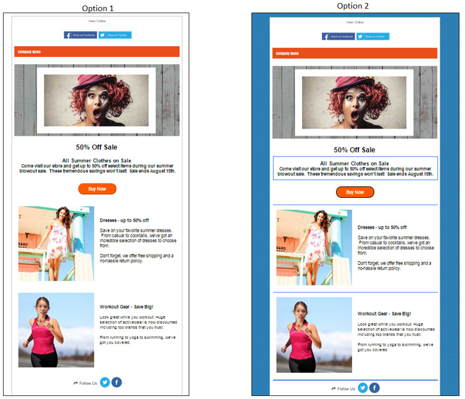
Let’s use this before and after of a sample email template that has been slightly altered to show some of the email design elements that can make your email more enjoyable to read.

Background Color or Image: Get your entire email to stand out by adding a solid background color or patterned image. With the blue background added in Option 2, the email content pops. However, keep in mind that some email clients like Outlook or Yahoo! Mail won’t display background images. Emails read on those email providers will appear with just a white background.
Text Highlight: Get your readers’ eyes focused on the message you want to highlight. Compare the first paragraphs between Option 1 and Option 2. By adding a colored box around the text, the eye is drawn to that area. You can also change the background color of that section of the box to highlight it even more. If you’re offering a promotion or having a seasonal sale, you could design a box with dashed lines to make it look like a traditional percent off coupon.
Call to Action Button: It’s usually the whole point of sending out an email in the first place– the call to action. And using a button to focus your readers on what you want them to do is an easy way to get them to take that action. Plus you make it simple for your mobile readers to get to your site if you give them a button to click. Design your button to get the most attention in the email. First the text needs to be as clear and concise as possible. The options are limitless, but the old standbys include “Buy Now”, “Get Started” or “Donate”. In terms of the button design, take into account the color, shape, size, width and border. The difference between Option 1 and Option 2 is the black border around the button. VerticalResponse offers a free button building tool within the email editor.
Break Up Your Content: If you’re sending out a lengthy email like a newsletter that has a few different articles, consider breaking up the content with some simple lines. Option 2 has a few lines added to break up the content between the articles. It also divides the main call to action “Get Started” from the secondary email content. Readers typically like to skim. Adding a divider line can help them discern different content elements.
One cautionary note, don’t go into email design overload where you inadvertently make the text difficult to read or the email too overwhelming to view. What’s worse than white font against a dark background? Email eyesores will only get your email noticed in a way that you don’t want. You know, like in “that’s the ugliest email I’ve ever seen” way. Always err on the side of simplicity with your design choices, and be consistent with your existing brand aesthetic.
Leverage background colors, text, buttons and dividing lines to set your email apart in the inbox.
This article was syndicated from Business 2 Community: How To Make Your Emails Pop In The Inbox
More Digital & Social articles from Business 2 Community:
- Social Media vs. SEO: Which is Better?
- The Impact of Online Reviews on Customers’ Buying Decisions [Infographic]
- Social Media Etiquette For Business – 10 Starters
- 6 Social Media Platforms To Capture Millennial Attention (In Order!)
- Attract Website Visitors for Your Personal Brand Through Social Media


