Color shapes how users feel and act on your website. Up to 90% of first impressions are based on color, and these decisions happen in less than 90 seconds. For ecommerce and small businesses, the right color choices can build trust, increase conversions, and guide user actions. Poor choices, however, can confuse visitors and erode trust.
Here’s what you need to know:
- Colors influence emotions and behavior: Blue conveys trust, red grabs attention, and yellow evokes happiness. Each color triggers specific reactions.
- Visuals drive decisions: 93% of consumers say visuals impact their buying decisions, with 84.7% specifically citing color.
- Strategic color use boosts engagement: Proper contrast, accent colors, and balance (like the 60-30-10 rule) help direct attention and enhance usability.
- Testing matters: A/B testing colors for buttons, headers, and backgrounds can reveal what works best for your audience.
- Accessibility is key: Ensure colors meet contrast standards to make your site usable for everyone.
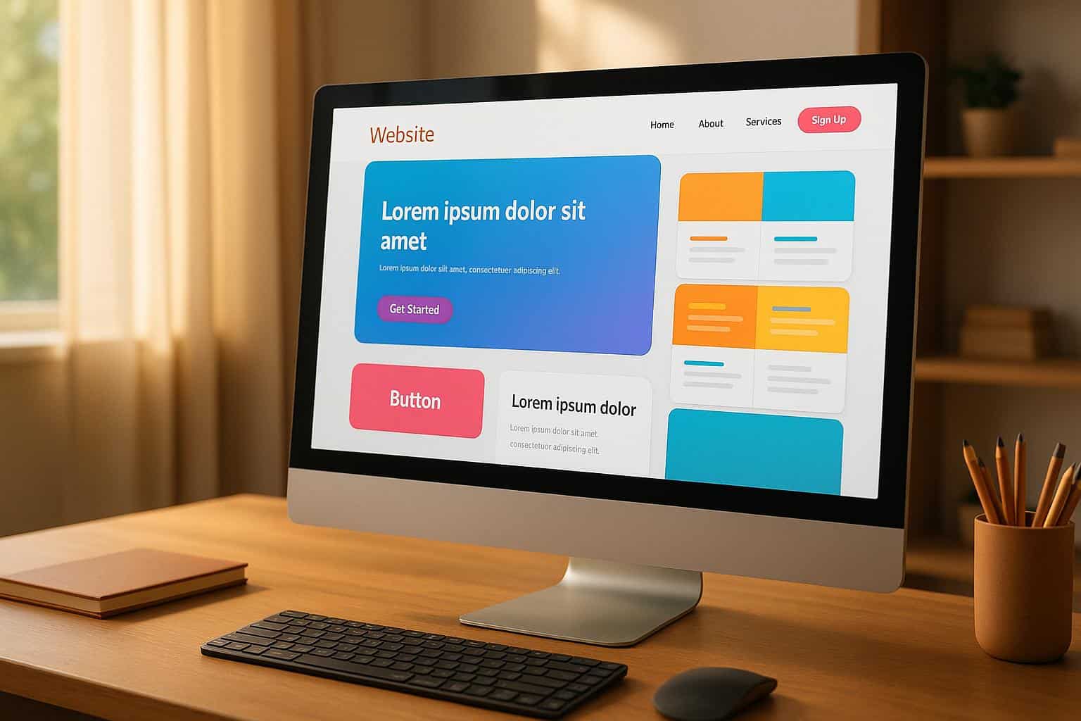
Color Psychology in Web Design // ThinkinsideTheSquare Episode #70
How Colors Affect User Emotions and Behavior
Colors speak directly to our subconscious, influencing our emotions and nudging us toward specific actions. This connection makes understanding color psychology crucial for designing websites that not only look great but also guide users in meaningful ways.
"Colors in UI design shape user emotions and behaviors, influencing how they interact with technology." – Robert Koch
Research shows that our brains process colors incredibly fast. In fact, users form an opinion about a website in just 50 milliseconds of landing on it.
Common Colors and Their Effects on Users
A 2020 study involving 4,598 participants across 30 countries revealed consistent patterns in how people associate colors with emotions. Let’s explore some of the most impactful colors:
- Blue: Often associated with trust, 35% of people link blue to feelings of relief. Its dependable nature makes it a go-to choice for brands aiming to convey professionalism and stability.
- Red: Known for its intensity, 68% of people connect red with love. Beyond romance, red grabs attention and encourages quick reactions, which is why Netflix uses bold red to evoke excitement and drive engagement.
- Green: Linked to growth and prosperity, 39% of participants associate green with contentment. In the U.S., green often symbolizes money and nature, making it a favorite for eco-friendly and financial brands like Starbucks and financial websites.
- Yellow: A color of joy, 52% of people associate yellow with happiness. Retailers like IKEA and Walmart use yellow carefully, balancing it with cooler tones to create an inviting atmosphere without overwhelming the viewer.
- Purple: Representing luxury and creativity, 25% of people connect purple with pleasure. T-Mobile’s use of purple alongside gold highlights sophistication and innovation, appealing to a refined audience.
- Black: A multifaceted color, black can evoke both exclusivity and sadness, with 51% of people associating it with feelings of sorrow. Apple’s strategic use of black, paired with white and gray, emphasizes simplicity and forward-thinking design.
Using Color to Drive User Actions
Smart color choices can significantly boost user engagement and conversions. Contrasting colors for call-to-action buttons and navigation elements are particularly effective in guiding users toward desired actions.
Colors like red, blue, green, orange, and yellow tend to perform well for CTAs because they evoke urgency or warmth. For example, Amazon’s orange-yellow arrow subtly encourages forward movement and progress, motivating purchases. In contrast, colors like black, white, and brown are less effective for action buttons due to their more subdued emotional impact.
The 60-30-10 rule is a popular framework for balancing color in design. It suggests using 60% of a primary color, 30% of a secondary color, and 10% of an accent color. Apple News applies this by combining a predominantly white/light gray interface (60%) with blue (30%) and pink accents (10%) for interactive elements.
Limiting your palette to two or three main colors helps maintain focus and prevents visual clutter. This approach enhances visual hierarchy, ensuring users’ attention is directed to key elements like CTAs or navigation.
Color Meanings for US Audiences
In the United States, colors carry specific associations that can be leveraged for better engagement. For instance:
- Green is closely tied to money and financial success, making it a strong choice for financial services and e-commerce platforms.
- Blue is widely used in American business culture to convey reliability and trust, which is why countless brands incorporate it into their designs.
- Red evokes urgency and excitement, making it ideal for sales promotions, limited-time offers, and other action-driven messaging.
- White symbolizes purity and celebration, often used in contexts like weddings or new beginnings.
However, cultural sensitivity is essential when designing for diverse audiences. While certain colors may have universal meanings – like red for "stop" and green for "go" – interpretations can vary based on individual experiences and cultural backgrounds.
As Kelley Gordon puts it:
"In general, while with the advent of globalization certain colors may have achieved standard meanings (e.g., red for stop, green for go), it is safest to assume that color interpretation will vary from culture to culture."
Turbify’s design tools can help you experiment with color combinations that align with your brand’s personality and resonate with U.S. audiences. The goal is to create a seamless and engaging user experience that reflects your brand identity while meeting audience expectations. Up next, learn how to integrate these insights into your overall design strategy.
Matching Colors to Your Brand
Colors do more than just catch the eye – they influence how people feel and behave. When your brand colors are thoughtfully aligned, they reinforce your identity and make a lasting impression. Think of your brand colors as your visual signature. Studies reveal that a staggering 62% to 90% of consumers form their opinions about a product or brand based solely on its color choices. This makes consistent color usage across your website a vital component for building trust and recognition.
When your website’s colors reflect your brand identity, it creates a cohesive experience that strengthens your message at every interaction. This consistency not only reinforces your brand but also fosters trust with your audience.
How to Use Brand Colors on Your Website
To create an effective color strategy, start by defining a core color palette that represents your brand’s values. Your primary color should embody your business’s essence, while secondary and accent colors provide flexibility for various design needs.
A tried-and-true method for balancing these colors is the 60-30-10 rule. This approach allocates 60% of your design to the primary color, 30% to secondary colors, and 10% to accents. Take inspiration from successful brands: Spendesk uses purple as its primary color, white as a secondary color, and teal as an accent. Similarly, Greenlist combines green as its main color with white for secondary elements and pink as an accent.
Accent colors play a critical role in drawing attention to key features. Use them sparingly for buttons, links, and interactive elements to boost user engagement. Overusing accent colors can overwhelm visitors and dilute your brand’s message.
Consistency is key. A uniform color scheme across your website enhances its professional appeal, improving consumer perception of design quality by 45%. This polished look builds confidence and trust among users.
Technical considerations are just as important as aesthetics. To ensure your colors look consistent across devices and browsers, set your design tools and monitors to the sRGB color space. When exporting images, use the "Save for Web" feature for optimal rendering. Don’t overlook accessibility – contrast ratios should meet WCAG standards, with at least 4.5:1 for normal text and 3:1 for form elements. Accessibility is crucial, especially since 55% of U.K. consumers have reported abandoning purchases due to accessibility issues.
Finally, create detailed brand guidelines that document your colors’ HEX, RGB, CMYK, and PMS codes. Include clear instructions for applying these colors to various website elements – like headers, buttons, links, and backgrounds – to ensure consistency whether you’re making updates yourself or working with a designer. This level of precision ensures your website delivers a cohesive and engaging experience.
Using Turbify‘s Design Tools for Color Customization

Turbify makes it easy to bring your brand colors to life with tools that allow for both section-specific and site-wide customization. Advanced users can even fine-tune designs using custom CSS.
To customize individual sections, simply click on the section you want to edit, then select "Change Color." You’ll find theme style options and additional color choices to match your brand’s specifications.
For site-wide consistency, go to "General Settings" in the hamburger menu, then navigate to "Style." Here, you can adjust both "Site background" and "Page background" colors to create a unified foundation for your website. This method mirrors the success of brands like NexBank, which uses a classic black-and-white color scheme to convey professionalism and trust.
Turbify’s Design Wizard offers even more possibilities for online stores. By starting with a generic template, you can customize your color palette to perfectly align with your brand’s aesthetic. You can also upload branded images for headers, logos, and footer backgrounds, ensuring every visual element reinforces your identity.
What’s great about Turbify is its adaptability. Whether you’re going bold with a color scheme like Discord’s deep purples and bright pinks or embracing a natural palette like Indiana Summers’ deep green, burnt orange, and golden yellow, the platform ensures your brand’s personality shines through while maintaining technical consistency across every page.
sbb-itb-7459f5e
How to Apply Color Psychology to Your Website
When it comes to applying color psychology to your website, it’s essential to think strategically. Choosing colors based solely on personal taste can backfire, as color heavily influences first impressions and buying decisions. Let’s dive into how audience research, color theory, and accessibility guidelines can shape your design choices.
Research Your Audience’s Color Preferences
Colors don’t just look good – they evoke emotions and behaviors. To make the right choices, you’ll need to understand your audience. Factors like age, gender, education, and cultural background all play a role in how people perceive colors. For instance, studies show men often prefer blue, while women lean toward blue and purple. Kids are drawn to bold, vibrant hues, while older adults favor soothing tones like blue and green. Socioeconomic status also matters – working-class individuals tend to like brighter primary and secondary colors, while wealthier or more educated audiences often prefer complex tertiary shades.
Geography and culture further influence preferences. People from tropical climates are naturally drawn to warm, bright colors, while those in colder regions favor more muted tones. Cultural meanings also vary – white, for example, symbolizes purity and weddings in Western cultures but represents mourning in many Eastern traditions .
To better understand your audience’s preferences, consider running surveys, organizing focus groups, or conducting A/B tests to measure emotional responses and conversion rates. Looking at competitors’ color schemes can also provide insights into what works in your industry – and where you can stand out .
Use Color Theory for Better Visual Design
Color theory offers a roadmap for creating visually appealing and effective designs. It all starts with the color wheel, a tool developed by Sir Isaac Newton in 1704. Understanding how colors relate to one another can help you create harmonious combinations. Here’s a quick breakdown:
- Primary colors (red, blue, yellow): The building blocks of all other colors.
- Secondary colors (green, orange, purple): Formed by mixing primary colors.
- Tertiary colors: Created by blending primary and secondary hues.
From there, you can use different harmony schemes to guide your design:
- Monochromatic schemes: Stick to varying shades, tints, and tones of a single color for a cohesive, calming effect. For instance, Nike‘s black, white, and gray palette keeps the focus on their products.
- Analogous schemes: Combine neighboring colors on the wheel, like blue and green, to evoke relaxation and trust. Airbnb uses this approach effectively.
- Complementary schemes: Pair colors opposite each other on the wheel, like Spotify’s green and pink, for bold visual contrast.
- Triadic schemes: Use three evenly spaced colors, as seen in Firefox’s orange, yellow, and purple palette, to create a dynamic, balanced look.
A practical tip? Apply the 60-30-10 rule: dedicate 60% of your design to a dominant color, 30% to secondary hues, and 10% to accents. Apple News nails this approach with its clean, focused layout. Also, consider the emotional impact of color temperature – warm tones (red, orange, yellow) energize, while cool tones (blue, green, purple) promote calm and trust.
Make Your Colors Accessible to All Users
Designing for accessibility ensures your website is usable for everyone – including the estimated 300 million people worldwide with color vision deficiencies. Around 8% of men and 0.5% of women experience some form of color blindness, so it’s critical to follow accessibility standards like the Web Content Accessibility Guidelines (WCAG). These recommend a minimum contrast ratio of 4.5:1 for regular text and 3:1 for large text or non-text elements .
Use tools like Adobe Color‘s Contrast Checker, WebAIM‘s Contrast Checker, or AudioEye’s Color Contrast Checker to ensure your designs meet these standards. And remember, color should never be the sole way to convey important information. Pair it with icons, symbols, textures, or labels to ensure clarity.
Be mindful of problematic color combinations that can be hard for users with visual impairments to differentiate. Avoid pairings like red and green, green and brown, light gray on white, or yellow on white . Instead, opt for high-contrast combinations, such as black text on a white background or dark blue on light yellow. Testing your design in grayscale can also help confirm that elements remain distinct.
Lastly, gather feedback by testing your site with users who have color vision deficiencies. Dana Randall, Head of Accessible UI Design at Level Access, emphasizes this point:
"We fail at our jobs when we create things that are difficult to use or unpleasant to engage with. With that lens, we may forget that not all people experience color the way we do".
Designing with accessibility in mind doesn’t just help those with impairments – it creates a better experience for everyone. By applying these principles, you’ll be well on your way to creating a visually appealing, inclusive website.
How to Test and Measure Your Color Choices
Once you’ve applied color psychology to your design, the next step is to test and measure the impact of your choices. Guessing which colors will work best can lead to costly mistakes, but systematic testing helps you uncover what truly drives engagement.
A/B Test Different Color Options
A/B testing is a reliable way to make informed decisions about your color choices. This process involves creating multiple versions of a design element – each with a different color – and showing them to separate groups of users. By comparing the results, you can pinpoint which color performs better. To get accurate results, focus on testing one variable at a time.
Start with the elements that have the most impact: call-to-action (CTA) buttons, menus, headers, and backgrounds. These are the areas that users interact with the most, so even small changes can make a big difference. For example, you could test a red CTA button against a green one to see which gets more clicks.
One of the most famous examples of effective color testing comes from Google. In 2014, the company tested 41 shades of blue for ad links. This project, led by Marissa Mayer (then VP of Search Products and User Experience), resulted in a shade that boosted click-through rates and added an extra $200 million in annual revenue. It’s a great reminder that even minor tweaks can lead to major gains.
To ensure your tests are reliable, make sure you have a large enough sample size and run the tests long enough to gather meaningful data. Segment your results by factors like device type and demographics for deeper insights. And don’t rush – jumping to conclusions without enough data can lead to poor decisions.
Platforms like Turbify make it simple to test color schemes. Their design tools let you quickly create variations for CTAs, backgrounds, and navigation bars, while built-in analytics track performance. Once your tests are complete, move on to measuring key engagement metrics to validate your findings.
Track Key Engagement Metrics
To fully understand the impact of your color choices, you need to track the right metrics. Without this data, you’re essentially flying blind. Focus on these key engagement metrics:
- Conversion rate: The percentage of users completing desired actions.
- Bounce rate: The percentage of users who leave after viewing just one page.
- Average time on site: How long users stay engaged.
- Click-through rate: The number of clicks specific elements receive.
- User retention: How well you keep users coming back.
For example, a major online retailer in 2022 switched their CTA buttons from gray to orange. The result? A 32% increase in conversions and fewer abandoned shopping carts.
Similarly, in 2023, a children’s charity revamped their website, using yellow for donation buttons and blue for volunteer sign-up pages. These changes led to a 24% rise in online donations and a 41% increase in volunteer registrations. These successes were only measurable because the organizations tracked detailed metrics before and after making changes.
Keep monitoring these metrics over time. User preferences and trends evolve, so what works today might not work in the future. Regular evaluations ensure your color strategy stays effective.
Color Impact Comparison Table
Understanding the strengths and weaknesses of different colors helps you make smarter choices based on your goals and audience.
| Color | Pros for CTAs | Cons for CTAs | Pros for Headers | Cons for Headers | Pros for Backgrounds | Cons for Backgrounds |
|---|---|---|---|---|---|---|
| Red | Urgent, grabs attention | Can feel aggressive | Bold, energetic | May distract from content | Passionate, energetic | Overstimulating, tiring |
| Blue | Trustworthy, calming | Lacks urgency | Professional, reliable | May feel cold | Stable, calming | Can be too subdued |
| Green | Positive, growth-oriented | May blend in | Fresh, natural | Less attention-grabbing | Relaxing, eco-friendly | Might not suit all brands |
| Orange | Friendly, confident | Can feel too playful | Warm, inviting | May lack professionalism | Fun, energetic | Overwhelming in large areas |
| Yellow | Optimistic, attention-grabbing | Hard to read on white | Bright, cheerful | Can strain eyes | Uplifting, positive | Fatiguing, hard to read |
| Gray | Neutral, balanced | Low visibility | Modern, clean | Can feel dull | Minimalist, unobtrusive | Might appear lifeless |
If urgency is your goal, try red or orange for CTAs. If trust is more important, experiment with blue. Keep in mind that context matters – a color that works well for a header might not be ideal for a background.
Conclusion: Key Points About Color and User Engagement
The colors you choose can influence how users behave, build trust, and encourage specific actions. By understanding these dynamics, you can create an online presence that resonates with your audience and drives engagement.
To recap, effective color strategies combine psychological principles with data-backed testing. Incorporating A/B tests into your process is crucial for refining your approach. A consistent color palette not only strengthens your brand identity but also reinforces credibility. However, it’s important to remember that while some colors work well on their own, they may clash when paired together. Striking the right balance is key to maintaining visual harmony.
Turbify makes implementing these strategies easier. Their Website Builder allows you to effortlessly customize colors, fonts, and layouts to align with your business identity. As SoftwareFinder.com highlights:
"Everything from colors to fonts and layouts can be customized to match your business requirements".
For those seeking even more control, Turbify’s Checkout & Registration Manager lets you fine-tune visual elements such as button styles, border colors, and background shades. If professional input is what you need, Turbify’s Website Design services offer expert guidance to help you make strategic color decisions that enhance user experience and boost conversions. Radhika Sivadi from the Turbify Resource Center advises:
"If you have an existing brand guideline document, share that at the outset. This can help focus their choices as far as colors, fonts, formatting, and more".
Remember, effective color strategies aren’t static. As user preferences shift and markets evolve, ongoing testing and tracking are essential. What works today may need tweaking tomorrow. By regularly reviewing metrics, you can ensure your color choices continue to drive engagement and support your business goals.
Thoughtful color selection is more than just aesthetics – it’s a tool for enhancing engagement, boosting conversions, and strengthening your brand. With the right tools and approach, your color strategy can become a key part of building meaningful connections with your audience.
FAQs
How can I choose the best color combinations for my website to engage my audience?
Choosing the perfect color combinations for your website begins with knowing your audience and the emotions you aim to inspire. Color psychology plays a big part in this – different colors can influence how people feel and act. For instance, blue is often linked to trust and professionalism, while red can spark feelings of excitement or urgency.
When deciding on colors, think about your brand’s personality, the meaning colors might hold for your audience, and how they connect to your website’s purpose. Tools like A/B testing or gathering user feedback can help you figure out which combinations work best for your visitors.
If you’re unsure where to start, seeking help from professional design services, such as those provided by Turbify, can guide you in creating a website that’s both visually striking and aligned with your goals.
How can I test and measure the impact of color choices on user engagement?
To understand how color choices impact user engagement, consider using A/B testing or multivariate testing. These approaches let you compare various color schemes and measure important metrics like click-through rates, time spent on a page, and conversion rates.
You can also monitor engagement indicators such as bounce rates and session duration to see how colors affect user behavior. For added precision, tools like colorimeters can help ensure color accuracy and consistency throughout testing, which plays a key role in delivering a seamless user experience.
How can I make my website’s color scheme accessible for users with color blindness?
When designing a color scheme that works for everyone, it’s important not to rely solely on color to communicate key information. Pair colors with icons, patterns, or text labels to make your content easily understandable for all users. This approach is particularly helpful for individuals with color blindness or low vision, ensuring they can interpret your content without difficulty.
Another crucial factor is maintaining strong contrast between text and background colors. High contrast makes text easier to read for everyone, including those with visual impairments. Considering that approximately 1 in 12 men and 1 in 200 women have some form of color vision deficiency, prioritizing accessibility in your design ensures you can connect with a much wider audience.