People have been shouting about how important it is to get your web sites and blogs optimized for multiple devices for at least last couple of years. But nothing creates as much buzz as Google declaring that a specific feature will be considered as a critical signal to rank results.
Everyone who manages their web site or a self-hosted blog needs to sit-up and pay attention to this new requirement. According to Google, come April 21, Google will tweak its search algorithm to push down search results of blogs and websites that are not mobile-friendly for the readers searching with mobile devices. What it means is that if your blog does not adjust the website interface based on the reader’s screen, the reader most likely won’t see your posts in their Search results.
How to check if your web site is Mobile-Friendly?
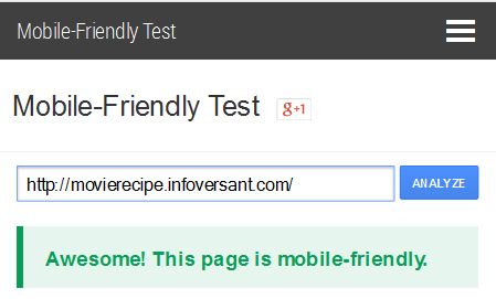
Is your blog mobile-friendly? A very simple and quick test is to search for your post using a mobile device and see if your result is tagged as ‘Mobile-friendly’ by Google in the results. But this time around Google has also released a tool in advance to check if your website or blog is mobile-friendly. To check, enter your blog URL and click Analyze to see if your theme settings are right for a mobile device.

There are multiple ways you can serve a mobile-friendly blog to your readers. One way to do this is to create a separate mobile website, for example, a sub-domain, and redirect the mobile device users to this web site. However, maintaining two different installations can be time consuming for micro business owners. Redirecting URLs can also be tricky and disrupt the user experience.
Alternatively, you can create a web site with a responsive design. A responsive design approach helps you to adjust the website’s look-and-feel according to the device interface. A separate section in the CSS or a different CSS for the mobile-friendly version adjusts the visual elements such as the navigation menu of the website to make browsing easy.
How to Make a Mobile-Friendly Blog
Responsive web design is easy with content management systems like WordPress as you have tons of blog themes that are mobile-friendly and can be installed within minutes. If you already have a responsive theme, but it still doesn’t look right on mobile devices, here are a few things you can change and tweak to make it right for your users across different devices.
Declare Viewport
Viewport means the size of the device interface which displays the web site to the user. Although there are a plethora of screen sizes now, you can define a catch-all command or define a different style for a few common screen sizes in blog CSS. Google advises the blog owners add the basic Viewport meta tag to their blogs for mobile device readers as follows:
This informs the browsers not to apply the standard tweaks such as font-sizes etc. when it detects a mobile device environment. Other than this, you can declare specific instructions in your CSS to handle different browsers and devices.
Handling Media
Other than the menus, another interface that usually disrupts the blog view are the images and embedded videos. If your header or logo image is too big and does not adjust to the device interface, you can also use the @media rule to instruct the browser to scale this image. You can also define the max width you want to display on the mobile device and control the blog appearance with @media rule.
Responsive Menu
Many of the responsive themes, though flexible, do not have a separate menu for mobile devices. The standard menu can become inaccessible to the readers and also disturb the overall layout of the blog.

Make sure that the theme you select has a responsive menu. If you already have a theme that you do not wish to change, use one of the numerous WordPress plugins to design a responsive menu.
Submit Sitemap to Google Mobile Bot
Google’s Fetch as Google allows you to submit your blog pages and posts to regular Sitemap. But using this utility, you can also submit your blog to Google’s mobile crawler.

Once you have made the necessary changes to your blog, make sure that you use this Google Webmasters Tools utility to submit your blog to the mobile and Smartphone crawler.
Blog owners who are not the DIY type and have WordPress websites, using the Jetpack plugin is another way to go for a mobile site without changing the theme. The plugin will show mobile users your content using a very basic theme, but will not change anything for the Desktop users.
This article was syndicated from Business 2 Community: Mobile-Friendly Blog Basics: Get Ready for the Google Update
More Digital & Social articles from Business 2 Community:


