Data by its very nature is dry and unappetising to us visually-driven creative marketers. Learn how giving your data a 2015 facelift can make it more palatable and meaningful.

Currently the average number of digital words we read every day is 100,500, this figure is only predicted to rise in 2015 with the further implementation of digital everything from bills to birthday cards. What doesn’t help is the fact that our attention spans have shrunk dramatically since the year 2000, from 12 seconds to 8 seconds by 2013, imagine what it is now! By the way, by way of comparison, a goldfish’s attention span is 9 seconds.
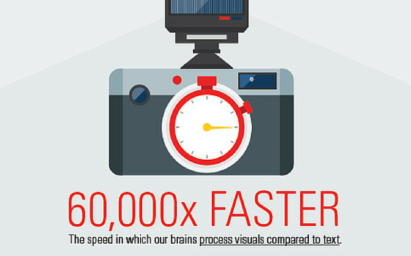
And it’s even tougher in the business world, professionals now spend 51% of their time managing information, instead of acting on it. And shockingly 90% of professionals say they throw away information without reading it. So we need visual solutions to ensure we impart data quickly, efficiently and in a form factor that will appeal in the boardroom. After all our brains process visuals 60,000 times faster than text.
The question is – how do we do this? There are a number of platforms and software that can aid in data visualisation. From visual dashboard software designed to number crunch data and help users to create clear, attractive data presentations based on it. To sites which display and publish data marketing content in a visual way such as infographics, slideshares and uberflips.
The benefits of data visualisation are far-reaching. The way in which it takes large volumes of data and presents it in an attractive, easy-to-understand format, helps the C-Suite and colleagues identify and monitor trends, so they can deal with issues quickly. Also the visualisation presents data without distorting or ‘weighting’ it when used correctly.
There are three basic steps you need to follow to effectively deploy data visualisations. Here they are:
- Understand your data and how different sets interact with one another.
- Find the angle or story for the data you want to present
- Consider which visualisation to deploy and its design type.
N.B. To ensure you have selected the right chart types for your data presentation check out this post.
There can be downsides to going visual however, one thing to consider is colour blindness when creating data visualisations. 8% of men and 0.5% of women have colour vision deficiency. For colour palettes that are colour blind-friendly, click here.
If you are still not inspired to give your marketing data a visual makeover for 2015 here’s a powerful example of taking dry data and transforming it into a dynamic presentation from academic Hans Rosling on the US in a converging world. While Rosling uses animation for his presentation his data could also be delivered via infographic or other forms of data visualisation.
Another example which can’t fail to get you excited about data, even if you are just using it for procrastination is the YouGov Profiler. Just search for any brand, person or thing and you will be amazed by the detail in the visual results. Just remember to get back to work at some point afterwards.
To sum up, the best way to give your marketing data a 2015 makeover is to explore the different visualisation tools available and decide which is right for your data and your target audience.
But remember that before you can create great data visualisation, you need data worthy of visualising – to find out how to extrapolate the right information download the eguide: Modern marketing essentials guide: Data Management
This article was syndicated from Business 2 Community: Why Your Marketing Data Needs A New Year Makeover
More Technology & Innovation articles from Business 2 Community:


