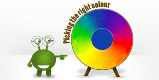
Picking the right colour for your logo design is vital. Every colour has a distinct emotional spectrum of associations, and if you’re looking at your logo design and you think one key element is missing it could well be that you need to use different colours (the other thing it could be is the font – see here). The best rule of thumb when considering logo colours is to keep an open mind, see different options and to keep the overall picture in mind. However, there are a few things which can be good to keep in mind including the use of bold colours, strong colours, colour shades, and the number of colours you use.
 Logo Design Tips: Picking Colours
Bold is bright, pastel is subtle
Bold colours usually have strong emotions associated with them. A logo made up of all bold colours is frequently used in children’s marketing – but the use of one bold colour as an accent to a logo can be very effective. Pastel colours are much softer and their impact is more subtle. However, logos which are made of all pastel colours can mute emotion so the best choice is to use pastels and bold accents together to get a complementary colour scheme.
Popular – grey, blue
Grey and blue are the two most popular corporate colours and are very on trend right now (in web design also). They are frequently perceived as professional and dependable colours, but they can also seem sombre and indifferent. The specific shade that you go with will obviously change the overall perception but it is always worth keeping your target audience in mind and what sort of emotional palette they might connect with.
Danger – pink, red, orange, yellow
Certain colours convey much stronger emotions than others and you always have to be wary of the marmite effect. If you choose to have a pink logo, for instance, you have to accept the fact that lots of people will be instantly put off by the associations (this doesn’t matter if you know your target audience doesn’t include those people but it is something to be wary of). Red and orange create similarly strong associations and can be a bit overwhelming or seem garish (yet they can also make very powerful accent colours to inject life into your logo).
Yellow is a different kind of danger colour, but not because of the associations – just because it can be hard to see. Yellow on a white background rarely works and if you want to use it you’ll need to think carefully about how you’ll be using your logo in print and online.
The right shade
Getting the exact colour(s) right is always a matter of trial and error. Describe what kind of feeling you want to evoke to your logo project manager and we can use that as a starting point. Or, if you have a specific colour in mind use a tool such as http://www.colorpicker.com/ to get the colour code and send it to us.
Number of colours
- A single colour will evoke a single emotion so you have to be sure that you pick exactly the right shade.
- Two complementary colours is probably the most popular choice in logo design
- Three colours can be very effective, especially if you want to use a stronger accent colour but not overwhelm your audience.
- Too many colours rarely works – the best logo designs are simple so it is best to stick with 3 or less. Even with 3 colours you will probably have two main colours and a smaller accent colour.
Have you thought about black and white?
Black and white printing is cheaper, and if you want to use your logo on letterheads or invoices that you’ll be using frequently this is something to consider. If you have a colour logo it will look best in colour but your logo design needs to be flexible to your needs. If you know you’ll be using your logo in black and white then it is worth asking to see how it looks in monochrome.
Experiment
Keep an open mind with your colour choices – it never hurts to see the different options! You can ask your project manager about suitable colours for your industry, or just ask to see a spectrum of choices. Remember that at British Design Experts you have unlimited revisions to get your logo design right and don’t be afraid of using them – we want your logo to be right as much as you do.
Did you find this article useful?
We have loads of great logo design articles on our business start-up advice blog to help you through the logo design process, and if you subscribe to our blog you can get these handy tips delivered straight to your inbox. We’d also love for you to join the conversation on our Facebook page and Twitter account where we share all the latest start-up news and design advice.
More Business articles from Business 2 Community:


