Many B2B companies dramatically underestimate the importance of a good website user experience. The excuses generally sound something like this, “Good website UX doesn’t matter for B2B, just B2C!” or “I can’t justify a UX spend to my boss,” or “I found this blog post that said ‘A’ and that’s all we need!” Because of this mindset, research from the Nielsen Norman Group shows that, “B2B websites have substantially lower usability than mainstream consumer sites.”
The sad thing about these misconceptions is that the exact opposite is actually true. While B2B companies underinvest in UX, they are investing more in content marketing and other lead-generation tactics that rely on website conversion to build a relationship with their prospects over extended sales cycles. When was the last time you kept going back to visit a website where you hated the UX and design?
Website conversion rates by performance
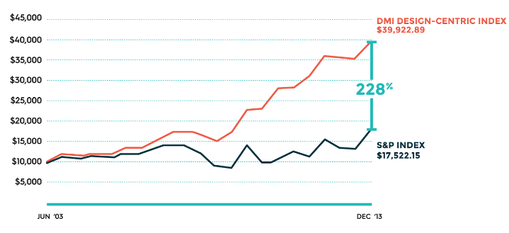
The numbers don’t lie. Research from the Design Management Institute shows that companies that used design-centric thinking outperformed the S&P 500 by 228 percent over a 10-year period.

In the book Cost-Justifying Usability, IBM reported that, “$20,700 spent on usability resulted in a $47,700 return on the first day the improvements were implemented and $68,000 spend on usability on another system results in $6,800,000 return in the first year,” according to UX Team. Not too shabby—and since then IBM has committed another $100 million to the cause.
In today’s post, we’re going to examine some of the key UX tenets that should be incorporated into any B2B website.
Leverage easy-to-use navigation
Make your navigation easy to use and understandable to a visitor. The goals of a B2B website are generally more complex than that of a B2C site in direct correlation with the sales process. But you don’t need to fit everything into the main navigation to address this. In fact, a HubSpot study found that 76 percent of customers only want a website that make it easy for them to find the information they seek.

Instead, think of the navigation the same way you would a marketing funnel, and move from the awareness stages down into the more bottom-of-funnel specifics (you can even use tools like Google Analytics, Mixpanel or KISSMetrics to track these conversion paths). Just because you have multiple business units or services doesn’t mean you have to jam them all in the main navigation. Linium, for example, did a great job of addressing this problem by using a simple Solutions mega-drop where a user can then segment by business unit or role:

This is not to say that mega-drops are always the right solution, but you get the idea.
Limit the number of CTAs on any one page
In the same vein, you don’t want to offer too many different conversion paths off of a page. Instead you should carefully select what the next best step would be for visitors who find themselves on that page and strategically move them to the best next step.
For example, when Bizible reduced the number of CTAs on its homepage from 14 to 7, it saw an increase of 29 percent in its homepage click-through rate.
Use effective content instead of walls of content
This is especially true on the home page. We like to think of the home page as the elevator pitch for your company. The subpages are more like a meeting. This post from UX Movement does a great job illustrating this mindset. By using effective headlines and shorter copy that grab users’ attention and encourage them to click, you’re able to guide them to the parts of the site that are most applicable to their needs.
On subpages you have more room to elaborate and go into detail, but ditch the jargon. It’s not 2000 anymore and buyers are less concerned about the “synergistic lift in cross-team structures” your product is going to deliver, only that it will “increase team productivity.” It’s fine to go into detail about your product or service, but remember to keep it simple.
Use a cohesive color palette and typographical hierarchy
Ninety-five percent of the information on the Web is written language, so typography can make a huge impact. Prospects do judge the book by its cover, and consistent branding and typography go a long way toward making your first interaction with site visitors a good one.
Additionally, as visitors dive deeper into the website, they use of one of two reading patterns (F-Pattern and Z-Pattern) to read the pages. By understanding these patterns and applying them to the specific purpose of each area, you can increase on-site engagement, build brand trust and increase conversion rates.
Finally, a consistent brand helps you build and maintain trust with your audience. Delivering on a consistent and high-quality experience is vital to building a lasting company, and one that your prospects will trust. This often starts with your website and marketing collateral, so make it count!
What user experience techniques have you found to be most effective on your website? Let us know in the comments below!
This article was syndicated from Business 2 Community: UX Tips to Increase B2B Website Conversion Rates
More Sales & Marketing articles from Business 2 Community:


