Hey, let’s talk mobile! Remember the days when your phone was just for calls and texts? Those days are long gone! Now, smartphones and tablets are our pocket-sized internet portals, letting us shop, connect, and find information on the go. That means your website absolutely needs to look great and work flawlessly on those smaller screens, or visitors will bounce faster than you can say “mobile-geddon.” Don’t worry, WordPress makes it easy! I’ll show you how to supercharge your site for those mobile moments.

Why You Should Care About Optimizing WordPress for Mobile
- Google loves it: Search engines prioritize websites that play nicely with mobile devices. It means better rankings for you!
- Happy visitors = more conversions: If your site loads like a snail on mobile, folks will ditch it in a heartbeat. Optimized sites keep people engaged and more likely to take the actions you want them to take.
- Stay competitive: Let’s be honest, everyone else is optimizing for mobile. Do you want to get left behind?
Understanding the Importance of Mobile Optimization for WordPress
Forget those clunky flip phones. Our smartphones are like mini-computers, letting us do everything on the go. That means your WordPress website has to work seamlessly on those smaller screens. “Mobile optimization” might sound fancy, but it’s really about making your site user-friendly for anyone not glued to a desktop or laptop computer. Let’s dive into why it matters:
Enhanced User Experience (AKA Keep Your Visitors Happy)
Imagine trying to pinch and zoom your way around a website that wasn’t built for phones – yikes! Mobile optimization is about making things easy. Your site should automatically shrink or expand to fit any screen perfectly. Think clear text, easy-to-tap buttons, and a layout that just makes sense. Happy visitors = longer site visits and that’s a good thing!
Improved Search Engine Rankings (Google Wants You to Get This Right!)
Google loves mobile-friendly websites. Why? Because they want their search results to be helpful, including steering people towards sites that work well. Optimize your WordPress site, and you’re much more likely to show up higher in those search results. More eyes on your site? Yes, please!
How to Test Your WordPress Site for Mobile Friendliness
Okay, you’ve built a beautiful WordPress site – but will it actually work on someone’s phone? Testing is the only way to know for sure! Here’s why it matters and the best tools to make it easy.
Why Testing is Important (Beyond Just Avoiding Frustration)
- Happy users stick around: People will leave if your site’s a pain to use on a phone. Testing finds those problem spots before visitors get annoyed.
- Google wants this: Search engines play favorites, and they like mobile-friendly sites. Test well, and you might get bumped up in search results.
- Make those sales: People are more likely to buy from (or contact) a business with a smooth-as-butter mobile website.
Tools for Testing Mobile Friendliness
Let’s take your site for a test drive! Here are some of the best (and easy!) tools:
- Google Mobile-Friendly Test: This is the big one! Google’s free tool gives you a simple “yes” or “no” on mobile friendliness and points out specific issues to fix.
- Responsive Design Checker: Want to see your site on many different screens? This tool lets you pretend you’re on iPhones, iPads, you name it – super useful for finding layout glitches.
- Your Browser’s Developer Tools: Feeling geeky? Most browsers (like Chrome: Ctrl+Shift+I) let you play with a “fake” mobile view. Great for pinpointing tiny problems.
Making Sense of Your Test Results
The tools did their job, now it’s yours! Focus on these things:
- The Squish Test: Does everything resize nicely when you go from “big screen” to “tiny screen”? Weird overlaps or cut-off text are red flags.
- Speed Matters: Mobile sites need to be lightning-fast. Tools will tell you if yours is making people wait.
- Can You Actually Use It? Forget just how it looks: are the buttons tappable? Are forms easy to fill out? Put yourself in your visitor’s shoes.
Remember, testing is how you go from a “good enough” mobile site to a fantastic one!
Best Practices for WordPress Mobile Optimization
Building a WordPress site is only step one. Now you need to make sure it actually works well for the tons of visitors using their phones! Follow these tips for a truly mobile-friendly experience:
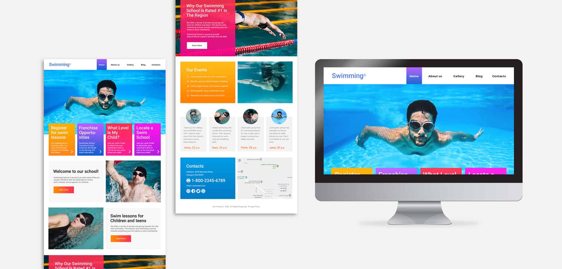
Choosing a Responsive WordPress Theme (The Easy Way to Get Started)
Think of a responsive theme as your site’s shape-shifting superpower. It automatically adjusts to fit any screen. Here’s how to find the perfect one:
- Buzzwords matter: Look for themes saying “responsive” or “mobile-friendly”. Duh, right? But it’s an easy way to weed things out.
- Test drive it: Most themes have demos—check those demos on your phone! Does everything look right?
- Don’t sacrifice style: Responsive doesn’t have to mean boring. Pick a theme that fits your brand and works on mobile.
Utilizing Mobile-Friendly Plugins (Your WordPress Power-Up Kit)
Plugins are like little add-ons for your site. Here are some must-haves for mobile visitors:
- WPtouch: Need a quick fix? This creates a separate mobile-only version of your site – great if your current theme is struggling.
- W3 Total Cache: This makes your site load lightning-fast and mobile users hate waiting.
- Smush: Shrinks your image files (without them looking blurry) for faster page loads.
- WP Mobile Menu: Clears up your navigation on those small screens. Tiny menus are hard to tap!
Optimizing Images for Mobile (Don’t Slow Things Down)
Pictures make your site pop, but giant image files? They’ll kill your mobile speeds. Here’s the fix:
- Shrink ’em: Use a simple photo editor to make your images smaller in size before uploading to WordPress.
- Compress ’em: Tools like Smush (the plugin mentioned above) can squish your images even more, without losing quality.
- Lazy Loading: This cool trick makes images load only as the user scrolls, making your page feel super snappy!
Improving Page Load Speed (Impatient People Are Everywhere!)
Slow sites = abandoned sites, especially on mobile. Get techy with these tips:
- Minify your code: This sounds complex, but plugins can do it—they clean up messy CSS and JavaScript files.
- Browser caching: It tells visitor’s browsers to “remember” parts of your site, so they load faster next time.
- Use a CDN: If you’ve got visitors worldwide, a CDN can serve your website from locations closer to them.
Simplifying Navigation for Mobile Users (Tiny Screens, Tiny Attention Spans)
Make it ridiculously easy for people to find what they need!
- Menus matter: Big, clear buttons, and not too many options. You can often hide less important stuff on mobile.
- Search is your friend: Slap a search bar right at the top of your mobile site.
- Finger-sized forms: If people need to type information, make the fields plenty big and easy to access.
Think of mobile optimization as an ongoing process, not a one-time fix. Keep testing and tweaking to give your visitors the best possible experience!

Monitoring Your WordPress Mobile Optimization Efforts
Okay, you’ve put in the work to make your site mobile-friendly, but how do you know it’s paying off? Monitoring is key! Here’s how to make sure things stay on track:
Google Analytics is Your Best Friend
This free tool is packed with info on how people use your site. Focus on these mobile-specific stats:
- Mobile Traffic: What percentage of your visitors are on phones/tablets? This shows you how crucial mobile optimization is for your audience.
- Bounce Rate: Do mobile visitors leave quickly? This could point to problems with your mobile design.
- Conversions: Are people buying, signing up, etc., on their phones? Track this to see if your mobile efforts are working.
Test, Test, and Test Again
The tech world moves fast! Plan to test your site regularly to make sure it’s still working perfectly on:
- Different Devices: Try it on an iPhone, an Android, or a tablet… the more the merrier.
- Different Browsers: Chrome, Safari, etc., can display sites slightly differently.
- User Feedback: Ask real people on phones to try your site and give honest opinions!
Keep an Eye on Mobile SEO
Google’s rules for mobile-friendliness can change. Stay ahead of the curve by:
- Following SEO News: Tech blogs often cover Google updates – make time to read up.
- Thinking Like a Mobile User: What would you search for on your phone? Optimize your pages for those searches.
- Speed Matters Most: Google loves fast-loading mobile sites. Keep making yours as speedy as possible.
Do you want to provide a fast and seamless experience to mobile visitors on your website? If yes, then you should definitely take a look at the amazing products offered by Turbify. Our WordPress plans are specifically designed to boost your site’s speed and enhance its mobile performance. With Turbify, you can take your mobile optimization to the next level and give your visitors the smoothest browsing experience possible.


