The world is quickly shifting into a mobile habitat, and if you haven’t invested into building a mobile version of your site yet, I’ll tell you who has, your competition. All of your mobile visitors are being swept from right under your feet, and you didn’t even know it.
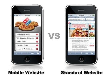
Here’s a perfect example of how a “mobile makeover” can drastically change the user experience you provide to your mobile visitors. Take a look for yourself:

The difference couldn’t be any more obvious.
1) Site Design: Keep it Simple, Uniform, and Easy to Navigate
Always remember, the size of mobile screens are much smaller to navigate than a laptop or desktop screen so keep your messages concise. Only give the most important information that is needed to make the user experience enjoyable and clear. Too much clumped up information can become distracting and annoying to your users on their small screens. Below are a few tips to think about:
- Keep your message simple and to the point.
- Avoid content heavy pages.
- Prioritize the content that you feel your users need most.
- Make sure your buttons stand out. Users should be clicking through your site to visit other pages, so make that experience is an easy one.
- Keep your site structure consistent. Users want to see a consistent navigation flow throughout your site.
- Make sure to minify your form fields. No one likes filling out long forms, especially on their phones, so make sure that you are grabbing the information that you really need from your users.
- If your site is large and complex, make sure you incorporate a search bar for easy navigation.
2) Create an Easy Scrolling Experience
“Pinch and Zoom” has to be one of the most annoying situations to find yourself in when you are on a mobile website, so why offer that to your users? You will lose most of your visitors due to the hassle this creates, especially if you are asking them to fill out a form.
Instead, use scrolling menu bars and checkable boxes to streamline the data entry process. By refining the content on your pages, you now have created the option to make the text size a whole lot bigger. This increases legibility on the small mobile screens, and makes the essential information accessible in one easy vertical scroll.
Furthermore, optimize your buttons. Make sure the action buttons are a decent size and have space in between each for easier navigation with fingers. Some fingers are bigger than others, so aim large with your buttons, so you can make it easy for all finger shapes.
3) Font Sizes: Keep them Legible and Large
Your goal should be to attract the average viewer to your website with easily legible text, getting rid of the need to pinch and zoom. You never want a user squinting to read the text on your site. The suggested font size is at least 14 or larger. Also, keep the font of your text less stylized.
4) Let Your Imagery Speak for Itself
Mobile sites are a visually tight space, this is the reality. So what is the best way to convey a lot of information? IMAGES! The right image can speak volumes, arousing a primitive experience that might have never been possible with words. When choosing the perfect image, here are some tips to remember:
- Choose an image that quickly draws attention in and compliments a seamless background.
- Another option is to use a simple, non-distracting image as the background of your page.
- Try to avoid clashing colors for your images and backgrounds. Always stay away from neon colors.
- Never allow your text and background to compete with one another, they should balance each other. So make sure the text color is easily visible on the background.
- Always keep in mind the load times of your pages. Larger images take much longer to load, and on mobile, patience runs thin. Compress your photos so your users can enjoy a fast image loading time.
5) Create a Simple Interface
Your visitors are viewing your page on a mobile device and there is a list of easy action options that you can provide for them to ensure mobile optimization.
Most consumers search locally, so why not make it easier for them to find and connect with you? More than ever, people are conducting mobile searches for local solutions, so when they land on your site make sure that your icons and action buttons are optimized. When incorporating icons and action buttons, make sure to use universal symbols. This will make it easy for your users to understand what to do and where they can do it on your page.
Consider including:
- Home
- Facebook Button
- Twitter Button
- Linkedin Button
- Tumblr Button
- Maps
- Click to Call
- 1 Stop Checkout
- Visit a URL
- Play this Video

Here is a great example of a mobile friendly universal navigation menu and content buttons.
Time to Take Action!
Every site owner must pay attention to consumer behavior because in 2015, consumers are expecting a dynamic mobile presence from every site they visit on their mobile devices. Mobile is quickly taking over, and to some consumers it has replaced the days of the desktop web.
So don’t get left behind!
If businesses want to attain their highest potential and profit from mobile, they need to create a seamless mobile experience that includes banner ads, correlating mobile landing pages, and a mobile optimized website.
The message couldn’t be clearer: If your business does not have a current mobile strategy in place, you need to stop what you are doing and immediately optimize for mobile so you can join the mobile wave occurring around you.
This article was syndicated from Business 2 Community: 5 Ways Your Site is Craving an Immediate Mobile Makeover
More Digital & Social articles from Business 2 Community:


