There are many dependable design trends that one can choose from in 2015, not to mention the constant flux of new trends that pop up. With so many options, how do we know which design trends are effective in their appeal? Some design trends become passing fads, while others remain at the forefront of what is considered “cutting edge” in online visual content. With a little help from Shutterstock’s infographic, top creative trends in 2015, I’ve made my own list of the top 5 visual content trends which continue to have appeal in 2015.
Top View

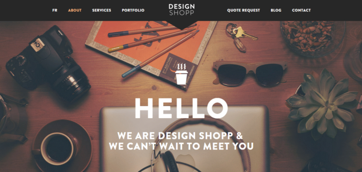
( source: designshopp)
If you’ve ever seen a Wes Anderson film, you’ll undoubtedly recognize this top view angle as one of his cinematic visual trademarks. In the past year, however, this photo angle has become highly popular for online visual content providers. While most generic photo angles highlight one specific element in the foreground and place the rest of the visual information in the background, the top view angle allows you to display the entire visual space evenly. Each element in the photograph has the same proximity to the lens of the camera and thus draws an equal amount of the viewer’s focus. This is a modern, sleek way to display a lot of information in one photograph.
Line Icons

(source: pixeden)
These icons are clean, crisp, modern, and easily viewable to boot. The neutral colored outline is complimentary to any color palette or page layout. Icons with a lot of detail in the design are considered too cluttered in 2015. Use these icons for a simplistic look. According to Shutterstock, searches for the “line icon” increased 921% in 2014.
Hipster Logos

You’ve undoubtedly seen this postage stamp style logo in more than one place on the Internet. Despite its ubiquity on the web, the variations you can make to this style are endless. The amount of information and detail that can easily fit within one of these stamps is another welcome asset. Illustrate a company tagline or mascot inside of one of these popular stamp templates.
Hipster Font

The tall and narrowly shaped fonts are here to stay for 2015. These font styles are easy to read, easily viewable and look great in all color palettes. They give any company information a modern look without needing any accompanying imagery. Steelfish or Knockout are great font options with this look.
Cinemagraph
https://flixel.com/cinemagraphs/festive/
The cinemagraph, a still image with moving elements, first became a trend in 2011 and remains immensely popular today. Since it is more difficult to make than a video or a GIF, its presence on the Internet isn’t quite as ubiquitous as the former two. Incorporating a cinemagraph ensures that you will stand out visually from other competitors. Now that social media platforms like Facebook have made it possible for GIFs to play directly on their platform, it’s probable that cinemagraphs will soon follow. For now, cinemagraphs are easy to embed on any blog or website.
Implement any of these design trends and see the improvements it can add to your page.
This article was syndicated from Business 2 Community: 5 Visual Content Trends That Are Here To Stay In 2015
More Digital & Social articles from Business 2 Community:


