There’s a lot of noise in the smartphone market, and not just when it comes to ringtones. Samsung is dumping millions on Galaxy S6 ads. The iPhone 6 is Apple’s best-selling product ever. Even Microsoft’s Lumia phones are hanging around, clinging to shelf space in Best Buys across America. But which of these handsets are worth your time?
In the spirit of the Clint Eastwood classic, let’s place nine of today’s most hyped phones into three categories: the good, the bad…and the ugly.
The Good
Excellent devices worthy of all the buzz
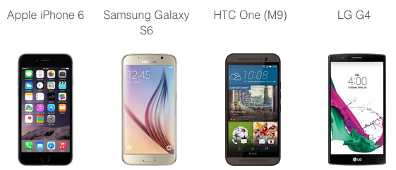
The Mount Rushmore of smartphones, the latest offerings from Samsung, Apple, LG and HTC are a clear notch above their competitors in both quality and price. Each device boasts industry-leading specs, rave reviews from experts and top performance in real-world tests.
If we had to crown a winner among the four, we’d pick the Galaxy S6. Samsung’s spec sheet is as solid as ever: 20 hours of battery life; three gigabytes of RAM; a crisp, 576-PPI display. But the real surprise here is hardware design, a category where previous Galaxy phones have fallen short. The S6’s all-metal body is a substantial upgrade from the plastic shells of Galaxies past. What’s more, the S6 matches the iPhone 6 in thinness, a category that Apple has dominated for half a decade.
Meanwhile, the LG G4 is the best big-screen phone on the market, edging out the upstart iPhone 6 Plus. The G4’s gorgeous 5.5-inch display and 16-megapixel camera are the biggest selling points—a handset that can simultaneously replace your tablet and digital camera. Some critics will point to lower battery life in real-world tests, but it’s a small price for such a brilliant display.
Apple takes a small hit simply for having the oldest phone on the above list. While the iPhone 6 has the smoothest operation of the bunch, its spec sheet is a bit less impressive—mostly because we’re comparing fall 2014 technology (the iPhone 6) to spring 2015 alternatives (the other three). The latest iPhone can still stand proudly with its closest rivals, but smart shoppers should wait until the iPhone 6S is released this October.
Finally, the HTC One M9 is the one elite phone that might paradoxically be considered a disappointment. The design is stellar, and it’s still the first mid-sized Android phone we’d recommend after the Galaxy S6. But the M9 remains remarkably similar to 2014’s M8—a half-step improvement rather than a true evolution. If you’re looking to save, consider getting an M8 cheap, or else waiting until 2016 for the M10.
The Bad
Decent-to-bad smartphones where hype far exceeds quality
Thanks to giant marketing budgets, the three phones on this list have all grabbed headlines. But none are worth your time.
If there’s a brand to feel bad for, it’s Microsoft’s Lumia line. Elegantly designed and visually striking, Windows Phone (soon to be “Windows 10 Mobile”) is the best mobile operating system no one will use. The biggest problem is third-party developer support: all the best apps tend to show up on iOS and Android, but only selectively on Windows—particularly ironic for a company that thrived on third-party support for two decades of Windows dominance. No matter how pretty your fonts and colors are, few apps mean few customers.
The second problem is a lack of identity. Does the Lumia want to be a budget alternative? An industry leader in camera quality? A businessperson’s choice? The recent Lumia 435 and 535 attempt to capture the low-end of the market, while earlier models like the 1020 and 1520 were decidedly high-end. In the end, by trying to be everything at once, the Lumia line fails to capture any one segment of the market. If you’re looking for premium, go back to the category above. If you want something cheap, you’re better off grabbing a two-year-old iPhone, HTC or Galaxy.
Compare Microsoft’s creativity to the disaster that is the Amazon Fire Phone, a handset that deserved its flop of a fate. Clunky and under-featured, the Fire Phone is more of a shopping tool than a true smartphone, a device perfect for diehard Amazon Prime users and obnoxious to just about anyone else. Ignore the 3D gimmick and stick to an Amazon tablet, like the Kindle Fire or Paperwhite. With the Fire Phone, Amazon came up ice cold.
The Ugly
Smartphones that miss the mark on a fundamental level
Poor BlackBerry. After owning the business phone market through 2009, the company has struggled to keep pace with its rivals. In 2013, the BlackBerry Z-line picked up a few favorable reviews, but most customers weren’t ready to abandon their iPhones and Galaxies.
More recently, BlackBerry has doubled back, releasing a pair of physical-keyboard handsets—a callback to the days of PDAs and flip phones. The BlackBerry Passport features a wonky square display, while the BlackBerry Classic sports a familiar rectangular design, albeit with a tiny display and large physical buttons.
BlackBerry’s move here makes sense. If they can’t compete head-to-head with Apple and Samsung, why not own the world of real keys and click-based typing?
Unfortunately, the phones truly do feel like 2009—and not just from the point of nostalgia. The Passport is awkwardly wide and short, unsuited for most modern apps and web pages. Meanwhile, the Classic’s screen is just plain small, a compromise that makes far less sense in 2015 than it did six years ago.
Physical-keyboard loyalists might consider giving the Passport a look, particularly if they tend to stick to email, notes and phone calls. For the rest of us, BlackBerry sticks out like an overripe fruit.
Compare Every Smartphone on the Market on SpecOut
This article was syndicated from Business 2 Community: Smartphones Roundup: The Good, The Bad and The Ugly
More Technology & Innovation articles from Business 2 Community:


