
Companies across the web are continually looking for the best ways to reach customers and encourage them to take action.
If you are a small business owner you too may be on the lookout for new ways to grab your customer’s attention.
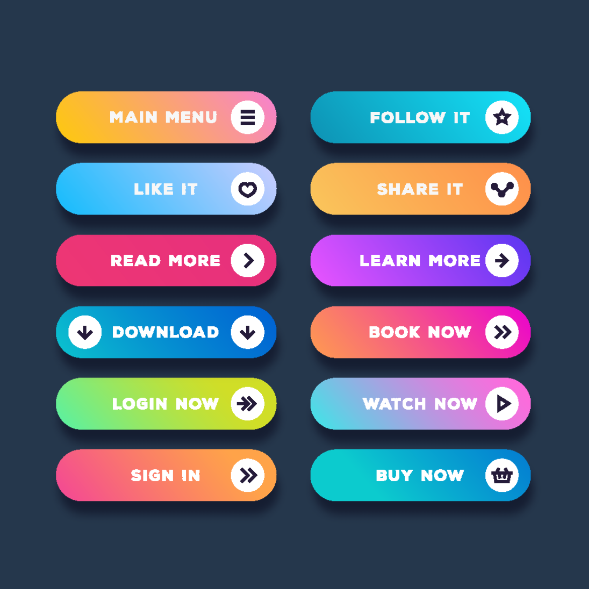
One of the easiest ways to do this is through your color scheme. Numerous studies have been done to prove what colors are the best for call to action buttons on websites.
Below are the top 3 best button colors for clicks followed by the three worst button colors for clicks.

The 3 best colors for call to action buttons:
1. Red. The color red stands out on most web pages. It invokes passion, excitement, and urgency. If you want your customers to take urgent action on your product (i.e. purchase it, download an eBook etc.) then Red is the right color. Funny enough, many people make the statement that Red usually goes hand in hand with stop, but studies show it is one of the best colors to use for call to action buttons.
2. Green. If the product or service you are selling relates to the environment, psychology, and peace, then green is the right call to action button color for you. Green is calming and can be associated with “Go” which is a motivator for many customers. It may be mentally easier for your clients to click on a green button rather than other colors.
3. Orange or Yellow. Orange is exciting and warm. Most individuals will associate it with warmth from the sun. This warmth in turn leads to people taking action. When customers feel happy they will be more likely to buy products that they associate with happiness. Let’s not forget that Amazon’s entire site is pasted with the color yellow and orange. It works for them, and they do TONS of website optimization testing, so there’s a lot of proof that it will work for your website too.
The 3 Worst colors for call to action buttons:
1. Black. Black is dark and gloomy. It makes many people think you didn’t try hard enough and it has a tendency to blend into the background of most pages, making it the worst color to use as a call to action button.
2. White. Even though it is technically the absence of all color, white is actually a horrible button color to use if you want your website visitors to take action. There a two reasons for this: First, white blends into the background, and second, white does not invoke emotions. These are two things you never want from your call to action button.
3. Brown. Brown has no connotation of warmth or action. It doesn’t motivate your customers to click on your call to action button. It instead is perceived by many as boring and ugly.
Color palettes vary from website to website but the most important thing to remember is that your call to action buttons should have a healthy contrast from the background of your website. If they do, you will likely see your buttons being clicked far more, which will increase your leads and sales.
Co-written by Peter Geisheker and Alanna Monical and originally posted at The Geisheker Group Marketing Blog.

More Business articles from Business 2 Community:


