We talk a lot about email.
We know the importance of email and if you’re following us there’s a good chance you understand the importance of email too. We’re no longer in the early stages of the internet; we’ve moved into the technology age and your customers have expectations about your online communications with them. There’s email rules, etiquette, and even laws that guide communication.

Via MarketingLand
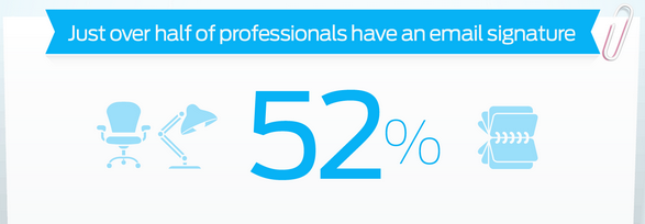
When you’re interacting with a potential client you want to put your best foot forward. You want to show your personality while still appearing professional and you need to do that to the very last line of text. Your signature is just as important as the body of your email. It’s your last chance for a first impression and considering only 52% of professionals actually have an email signature, you should make yours great.
Here are 3 Quick Tips for a More Effective Email Signature:
1. Cut back on the inline images
I cannot emphasize this enough.
I understand that putting social media icons is much more fun and using your company logo is something you might be personally attached to but whenever and wherever you can, remove the images. The more images you have the slower your email loads, and plenty of email servers won’t open your images without consent from the recipient which means your signature ends up showing up as a bunch of image attachments that might never get opened.
On that note, cut back on the crazy fonts and colors, too. Both of these will also slow down an email load time and if there’s one thing people reading email don’t have, it’s patience.
If you just have to have images, use a hyperlink or make sure to put alt text in place of the image. Sometimes those images won’t load in different email clients, devices, or browsers.
2. Link to something that makes people want to interact with you
I’m not just talking about social media here. By now we all know how these can help. I’m talking about your latest blog for a business partner’s organization, the latest ebook you wrote on nurture campaigns, or the YouTube video of the speech you gave at the National Conference of Important People earlier this year. You have the opportunity to showcase those things in one simple line in your signature.
I’ve seen signature examples from Hubspot with a line about their Inbound Conference or Marketing Grader Tool, and they made the suggestion in a blog post to include links with relevant things to your business.
It also gives you one more chance to connect with the recipients of your emails, beyond the body of the email. This added information in the signature gives them the potential to learn more about you as a business and a professional — so, seize the opportunity!
3. Provide only the best contact information
Your clients (or potential clients) don’t need your landline, mobile number, fax number, address, Skype name, Twitter handle, LinkedIn, Gravatar, mom’s email address, etc. They need to know how to get in touch with you and how to do that as quickly and easily as possible.
Give your recipient less than four (and more than zero) options for contacting you and if you want to make it super simple for them, make note of which one is the best option. No contact information and your clients will either email you back or avoid emailing you out of frustration. Too much contact information and your clients will be overwhelmed and avoid contacting you for fear of reaching out the least efficient way. For example, you

Our VP of Marketing’s awesome signature
Having a great email signature isn’t rocket science. It’s a quick and easy way to make one last great impression so it’s always worth taking the time to refine it. Take a step back and look at your email signature as if you were your own client.
Does your signature say “remember me” for all of the right reasons?
This article was syndicated from Business 2 Community: 3 Quick Tips for a More Effective Email Signature
More Digital & Social articles from Business 2 Community:


