Continuing the Refinement
17 months after Microsoft released Windows 8 and RT to the world, the operating system is still very much evolving. The 8.1 update in October last year dialed back some of the radical changes, like restoring the Start button (though not the good old Start menu) to the taskbar, and allowing the desktop to be shown upon sign-in instead of the tile-based Start screen. Of course, there’s much more than that in Windows 8.1: we also get an expanded PC Settings app, a Bing-driven unified search system, a redesigned Windows Store that allows automatic updating of apps, deeper SkyDrive (now OneDrive) integration throughout the OS, an updated Internet Explorer, and more.
But criticisms for the touch-focused OS continue to come, especially from users accustomed to using the keyboard and mouse. The first major update to Windows 8.1 seeks to reduce this confusion, and bridge the touch and desktop gap further through many (and sometimes, blatantly in your face) UI tweaks.
For the market, this Windows 8.1 Update will also herald the arrival of lower-priced Windows 8.1 devices. This is because Microsoft is lowering the minimum hardware specifications required to build a Windows 8.1 PC or tablet. For example, manufacturers now have Microsoft's blessings to make a Windows 8.1 device with only 1GB RAM and 16GB storage. There's also support for 64-bit Windows on Intel Atom processors. For such low-cost devices, hardware makers can also take advantage of a new and cheaper Windows licensing. In fact, for devices with a screen size smaller than 9 inches, hardware makers need not pay a single cent for Windows.
We can go on and on about the other new features in this first major update to Windows 8.1. For now though, let’s first explore the UI changes, which you’ll see are mainly for the benefit of keyboard and mouse users.
1. Power & Search Buttons on the Start Screen
After the update, you’ll notice that there are two new buttons – Power and Search – at the top right of the Start screen, right beside your account picture. For mouse users, that means no more slamming the cursor to the top or bottom right corner of the screen to bring up the Charms bar, and then clicking the Settings charm just to get to the Power menu.
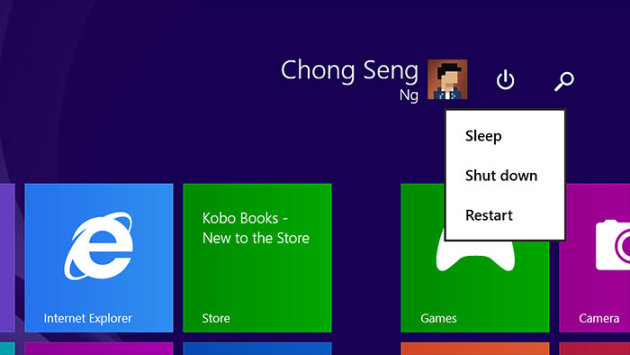 Shut down, Restart, and Sleep commands are literally just a click away.
2. Desktop-style Context Menu When You Do a Right-click
Before the update, when you tap and hold on a tile in the Start screen, the tile will be selected and a menu bar will pop up at the bottom, showing you more options. The same thing happens when you right-click a tile. One can argue that this isn’t very efficient for mouse users because you’ve to drag the cursor all the way down to the menu bar at the bottom.
After the update, this menu bar no longer appears when you do a right-click in the Start screen or on an app in the All Apps list. Instead, you get a context menu right beside your cursor – you know, just like the desktop environment.
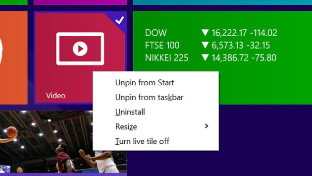 Right-clicking a Start screen tile now gets you a regular context menu.
3. New Mouse UI for Closing & Minimizing Modern-style Apps
Mouse users are very familiar with the process of closing desktop apps and windows: just click that X button at the top right. For full-screen Modern-style apps, the way to close an app is quite a chore and isn’t very obvious, which is to click the top of the app and drag it to the bottom of the screen.
After the update, when you bring the cursor right to the top of the screen, a title bar will appear. In fact, to make this more discoverable, whenever you open a Modern app, the title bar will also appear for a brief moment.
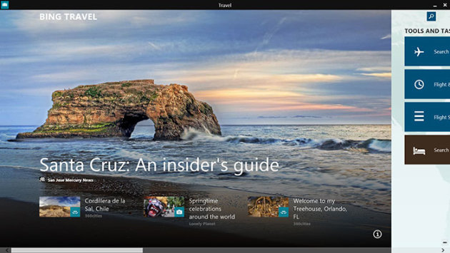 Bring the mouse cursor to the top of the screen to reveal the title bar.
You can now close the app by clicking – you guessed it – the Close (X) button on the right. There's also a Minimize (-) button.
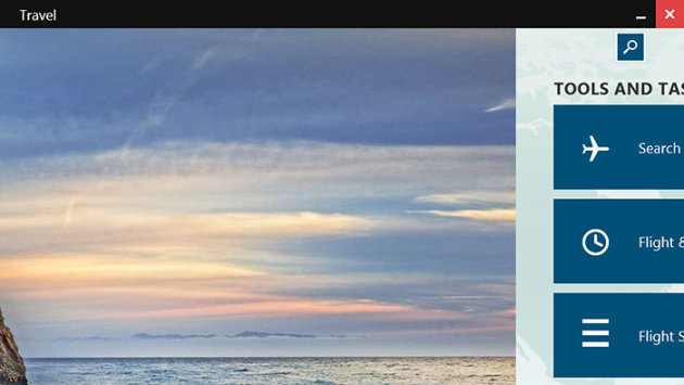 There are Close and Minimize buttons.
On the other end, you’ll see the icon of the app. Clicking it brings up more options, including Snap View options.
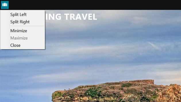 And a couple more Snap View window-splitting options on the left.
4. Improvements to the All Apps List
In Windows 8.1, if you want to see all the apps you’ve installed, you just swipe upwards at the Start screen. But how do keyboard and mouse users know what to do, especially when they’ve just installed a new app, and don’t see its tile on the Start screen?
After the update, when there are newly installed apps, a message will appear at the bottom of the screen. It's not a big deal for existing Windows 8.1 users who know where to look; like we said above, it's meant to reduce those 'huh?' moments for new users.
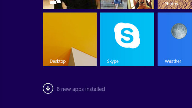 Sometimes, spoon-feeding is necessary.
In addition, the All Apps list now sorts the apps in alphabetical order. This is very similar to how the app list in Windows Phone 8 works.
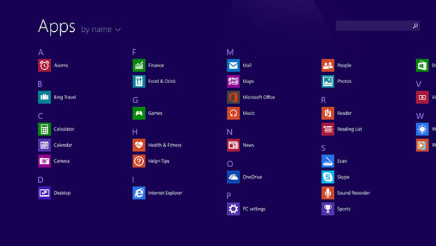 Apps are sorted in alphabetical order just like Windows Phone 8.
You can also click a letter to get a zoomed-out letter overview. Before this, if you're using a mouse, you've to drag the cursor to the bottom right corner and click the minus (-) button. This bird's eye view is useful if you’ve a ton of apps, and when dragging the horizontal scrollbar to go from one end of the screen to the other takes more time.
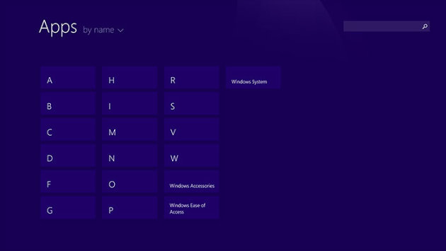 Clicking a letter is another way to get to this bird's-eye view.
5. Show More Items in Start Screen & All Apps List
Windows 8.1’s Modern-style (Metro) environment takes both screen resolution and size into consideration to determine the size of the on-screen elements (e.g., the tiles, the text). But if you’ve a high DPI screen (say, the Surface 2), you may want to fit more items on the screen.
After the update, there’s a way to decrease the DPI scaling for the Start screen and the All Apps list. Simply go to the Settings charm, select ‘Tiles’, and enable ‘Show more tiles on the Start screen’ and ‘Show more apps in Apps view’.
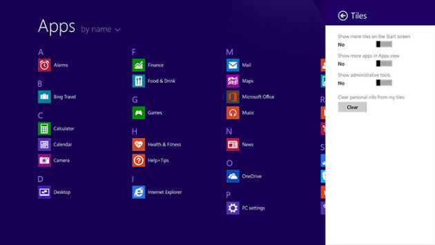 DPI scaling comes to the Start screen (sort of).
Take a look at the below and after screenshots below. Notice how the elements have shrunk to allow the same space to fit more items.
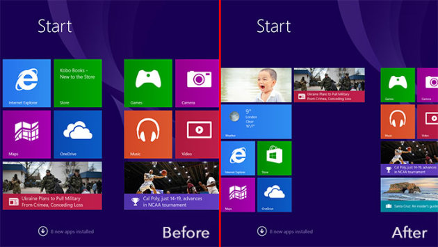 Before and after 'Show more tiles on the Start screen’ is enabled.
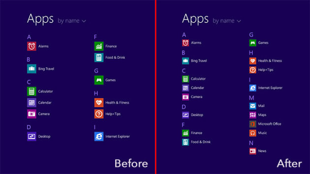 Before and after 'Show more apps in Apps view’ is enabled.
6. Pin Windows Store Apps to Desktop Taskbar
You may have noticed from the screenshots above that you can now pin Windows Store apps to the desktop taskbar. In case you haven't, just right-click a tile on the Start screen or an app icon in the All Apps list, and select 'Pin to taskbar'.
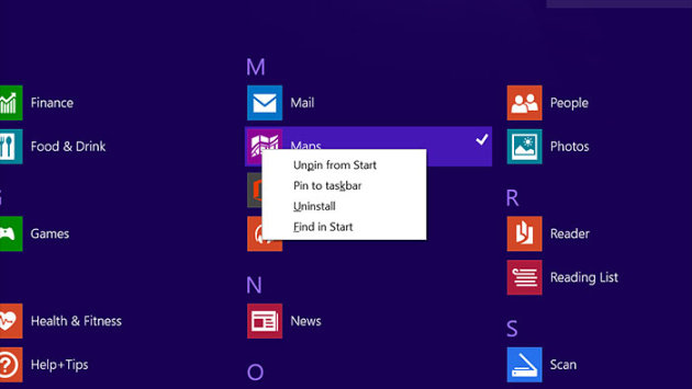 The ability to pin Windows Store apps to the taskbar is one of the major new features in Windows 8.1 Update 1.
By that extension, it also makes sense that you can now know which Windows Store apps are running by looking at the taskbar.
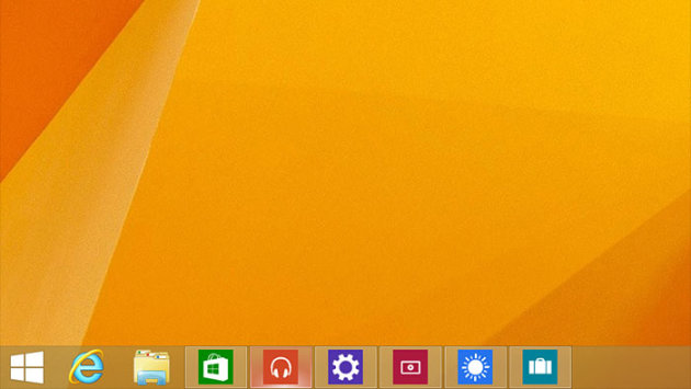 Like desktop apps, it's easy to tell which Windows Store apps are running.
If you don’t see them, or for some reason you wish to turn this feature off, the control is found in the Taskbar and Navigation properties panel. The easiest way to find it is to just type ‘taskbar and navigation’ in the Start menu and let Windows search work its magic.
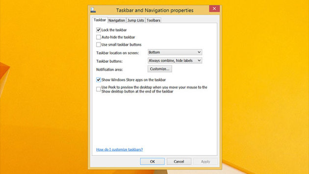 Of course, you can turn this feature off.
Like how it works for desktop apps, you can see a thumbnail preview of the last opened window when you hover over a Windows Store app icon on the taskbar. Embedded active tools are supported too, so for media apps like Xbox Music, you will also get a simple set of playback controls under the thumbnail.
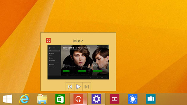 An active toolbar will show up too if the Window Store app supports it.
7. Taskbar in Windows Store Apps & Start Screen
If you allow the showing of Windows Store apps on the taskbar, the taskbar will also pop up when you bring the cursor to the bottom of the screen when you’re in a Modern-style, full-screen, Windows Store app. (Yes, you read that correct.)
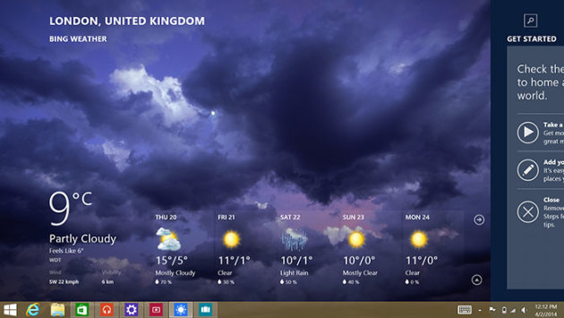 With this update, the taskbar is no longer a desktop exclusive.
Heck, the taskbar even appears in the Start screen. For sure, this makes switching between desktop and Windows Store apps much, much easier. For those used to Modern-style apps, it may be a tad disconcerting to see a desktop taskbar in a Modern environment, but most of us will agree this is for the greater good. In fact, Windows 9 (expected in mid 2015) is expected to go even further, letting users run Windows Store apps (as floating windows) in the desktop environment.
While nothing's changes for the Start button/menu in this first update, Microsoft is teasing a future update for Windows 8.1 that brings back the familiar Start menu, complete with Live Tiles on the side.
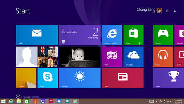 Repeat after us: Taskbar. On. The. Start. Screen.
8. Boot to Desktop Automatically for Non-touchscreen Devices
In Windows 8, the tile-based Start screen is the first you see after signing in. It’s the same on Windows 8.1, but the OS now allows you to choose if you wish to show the desktop instead of the Start screen. This option again resides under the Navigation tab in the Taskbar and Navigation properties control panel. While this is widely regarded as a sensible move, it’s also not wrong to argue that the average, non-power user would never know about it. So for these people, the Start screen continues to frustrate them.
With this latest update, if you did a fresh install on a non-touchscreen device, the OS will sign-in to the desktop automatically. We don’t think this would entice more people to switch to Window 8.1, but at the very least, we should hear fewer stories of grandmas asking what happened to their familiar desktop after upgrading.
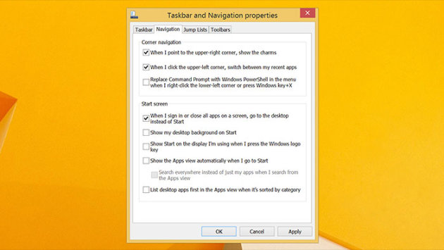 Checking this option also means you return to the desktop (instead of the Start screen) when you close all app …
9. A Slightly Improved PC Settings
The PC Settings app got a huge boost in Windows 8.1, taking on many more responsibilities so that you don't have to visit the desktop Control Panel so often. The latest update continues to bring new features, though it's much less dramatic this time round.
For one, in the main PC Settings menu, you get a direct link to the desktop Control Panel. It probably saves you an extra click or two if you can't find a particular setting in PC Settings, and have no choice but to fire up Control Panel.
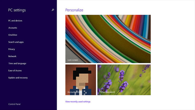 A link is often the quickest way for mouse users to get from one place to another. Case in point: The Control Panel …
Secondly, there's now a new Disk Space utility (under PC Settings > PC and Devices), which gives you an overview of your storage, and the opportunity to free up some space. The 'See my app sizes' link will bring you straight to the App Sizes page (which already exists in Windows 8.1 under PC Settings > Search and Apps), where you can uninstall Windows Store apps.
The Disk Space page also tells you the amount of space taken up by different media and files, but there's no way to take any action here. For example, when you click or tap 'Pictures', neither the Modern-style Photos app nor the desktop File Explorer opens to bring you to the Pictures folder.
And at the very bottom, you've an option to empty the Recycle Bin. However, there's no way to see what's in the Recycle Bin.
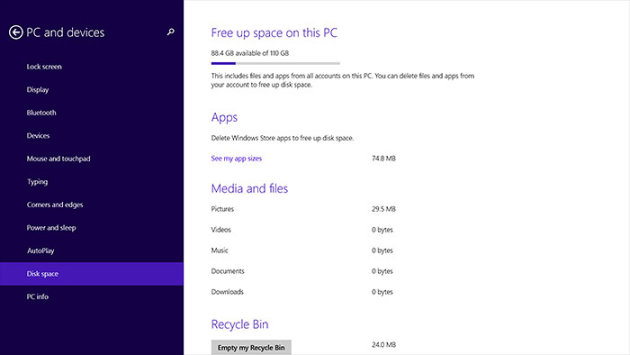 The marquee feature in PC Settings this time round is the Disk Space utility.
Final Thoughts
Perhaps it's not entirely correct to say that Microsoft is using this update to undo some of the OS' previous changes. The Modern environment is still there, and the UI is still very much touch-focused. As you can probably tell by now, it's again about making the OS less confusing, and easier to navigate for traditional keyboard and mouse users.

