Your marketing email has tons of competition in your customer’s inbox — but it’s still a high-converting channel when you put together a strong message that’s easy for customers to understand. Use these four tips to add clarity to your message and improve the performance of your emails.
Use the Preheader
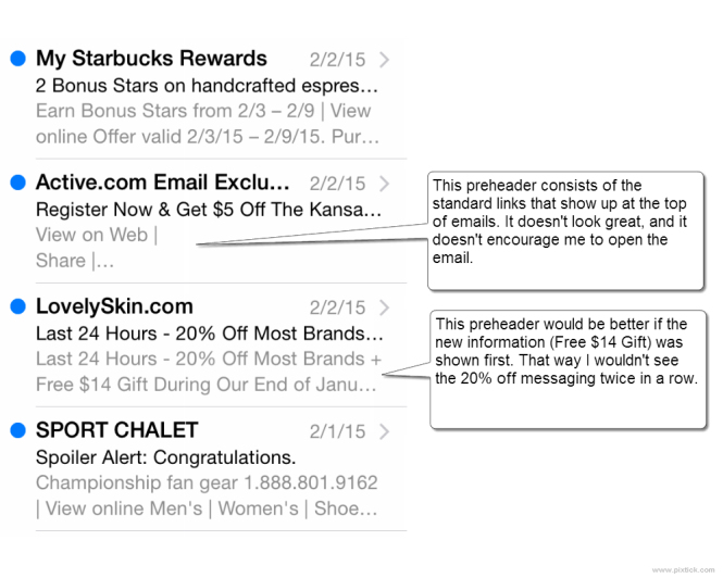
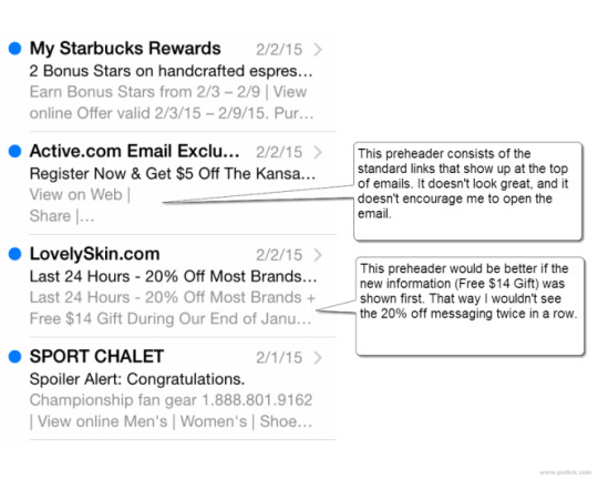
When you view your email box, mobile or desktop, you’ll often see the subject line plus some additional text. That additional text is the preheader.
The preheader is defined by your users’ email clients, and it comes from whatever text appears at the top of your email. As shown below, sometimes this works for you, and sometimes it works against you.
Takeaways
Be aware of how your preheader looks on the most popular mobile devices and email clients. Remember that the sender name, subject line and preheader are the only pieces of information your customers use when deciding to open your email. If the preheader doesn’t contribute positively, change it.
Be Direct
The most important information should be the most prominent in your email. Yeah this is one of those common sense tips, but it’s also easy to overlook. Take a gander at this email from La Quinta as an example.
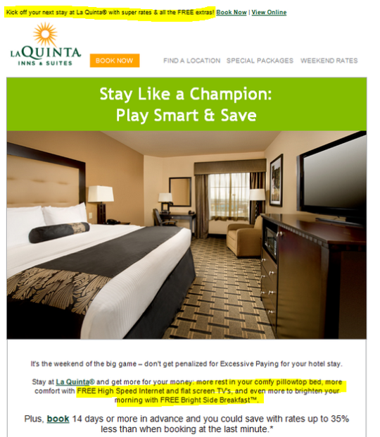
Can you tell what’s most important in this email? I see three different messages:
Super rates and FREE extras
Save up to 35%
Stay like a champion: play smart and save
Interestingly, the last one is the most prominent, but least specific. And, it’s the only one of the three that isn’t immediately followed by a “Book Now” button or link. There is a “Book Now” button above, but people don’t read bottom-to-top and right-to-left. If you scroll down, the next available link is on the other side of a massive image.
Takeaways
Write your value proposition as strong as it can be. (Test it if you need to.) Position it prominently in your email design and follow with a clear call to action.
Tell Them What to Do
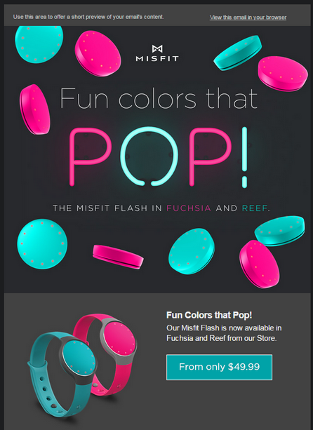
This bold email from Misfit fails on two levels. First, there is generic text in the preheader. Someone should have noticed that before deployment. And secondly, there is no call to action. Sure, there’s a blue rectangle with a price in it. But is that a button? Or just part of the design? What happens if I click on it?
A simple and recognizable “Shop Now” button would answer those questions.
Takeaways
Your customers don’t have the time or patience to decode your email. Give them a clear call to action so they know what to do and what happens next.
Let the Destinations Do Their Jobs

In this email, Wired provides the user with instructions on what to do after clicking through and downloading the app. There are two reasons this is a bad idea.
An email should focus on one primary call to action. That call to action is the immediate next step you want the user to take. Any content that goes beyond that immediate next step distracts from your primary message and will likely be forgotten anyway.
Secondly, the destination of your email, usually a landing page, should clearly define the next steps. If it doesn’t, you need to fix that at the destination, rather than putting extra instructions in your email. In the case, the Wired app should offer clear instructions for new users. Tell them what to do and how to find their account number.
For another example, think of an email you might get from a bank. Let’s say you have the bank’s credit card, and the email encourages you to sign up for a new savings account. That email should not provide a numbered list of steps you must take once you reach the savings account landing page. That’s way too much information. Instead, the email should direct you to a landing page. The landing page then picks up the responsibility with clear guidance on starting the application process.
Takeaways
Whether it’s a purchase or a download or demo request you want from your customers, don’t reveal the totality of the process right out of the gate. Give them only the information they need to move just one step further.
These four easy email tips involve providing your audience with clear and concise information about what you’d like them to do. How well are you implementing these strategies today? Leave a comment and let us know!
This article was syndicated from Business 2 Community: 4 Easy Tips for More Effective Emails
More Digital & Social articles from Business 2 Community:

