 What is the Difference Between Infographics and Data Visualization
Both infographics and Data Visualization are tools used to visually represent data. They make it easier for the web users to grasp difficult concepts by communicating wider context in a summarized visual form. The lengthy reports, statistics and super long descriptions are by no means in the best interest of a busy society. Infographics and Data Visualization are both great time savers and allow users to easily share information on their own blogs and on social networks. Another factor that encourages the use of these two tools is the graphical nature of the web content nowadays. Therefore as graphical content, the duo will better fit into the modern sites enhancing the web experience and is part of the whole quality content concept.
What are Infographics?
Infographics are information graphs in short. What are infographics? Infographics are visual representation of facts, events or numbers. The visual patterns and trends are used in such a way that human cognition is enhanced. You can find a lot of illustrations and iconography involved in this. Newspapers would be one common place where you would find a lot of these, usually used to show weather, map and poll statistics. Infographics are made of three major components, the content, the visual part and the knowledge. Scientists have found that more than 50% of the working portion of the working human brain is dedicated to the visual functions.
The infographics therefore can convey a lot of information at once to the human mind. They should therefore be designed ensuring the maximum appeal and comprehension in order to leave a most memorable imprint in the viewer’s mind. They essentially deal with a particular dataset and are created in an audience specific way. Therefore making infographics demand creativity in picking the elements and building the relationships between them. Also the designers should have a good understanding of the context the Infographics is trying to communicate because the whole theme should be built around the meaning.
Here is an example of an Infographic.
A huge amount of work goes into these graphics. It is called the The Biggest Shift . Assuming these statistics are accurate, it highlight the significance and magnitude of social media. (via Derri Hasmi)
 The-Biggest-Shift-infographic-by-Derri-Hasmi
Also see 50 informative and well designed infographics.
What is Data Visualization?
Data Visualization is all about numbers. The information is abstracted into a schematic form so that the human mind will be able to easily process the bulks of repetitive information and get a clear idea about the statistics at a glance all at once. The generation of the Data Visualization elements is basically scientific and are generally handled by software. These usually take the form of graphs, maps or charts.
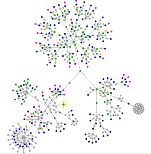
Here is an example of data visualization below.
HTML consists of so-called tags, like the A tag for links, IMG tag for images and so on. Since tags are nested in other tags, they are arranged in a hierarchical manner, and that hierarchy can be represented as a graph. This visualization is based on http://letsbuildwebsites.com/ . As you can see we have no control of the data shown.
The colors indicate the most used tags in the following way:
blue: for links (the A tag)red: for tables (TABLE, TR and TD tags)green: for the DIV tagviolet: for images (the IMG tag)yellow: for forms (FORM, INPUT, TEXTAREA, SELECT and OPTION tags)orange: for linebreaks and blockquotes (BR, P, and BLOCKQUOTE tags)black: the HTML tag, the root nodegray: all other tags
You can make your own data visualization of your website at http://www.aharef.info/
You should also see 50 great data visualizations. There are some amazing representations there.
So What is the Difference Between Infographics and Data Visualization?
As much common features as the infographics and data visualizations share, there are some significant differences. Infographics are basically designed to communicate a subjective plot. The information is discreet and focuses on expressing a particular theme to the audience. The Data Visualization on the other hand takes a more objective approach. It’s a more or less a holistic representation of quantifiable information. The purpose of Data Visualization is to simplify a lot of highly quantized information and then present it in all in one place. A greater concern is shown in the gestalt than the editorial value of the context. These are therefore more likely to be generated by computer programmes with the use of algorithms as they contain information hard for the human mind to process at once.
Infographics = Manual Work
The Infographics on the other hand takes more manual work and editorial processes as they focus on the presentation. There are no particular tools to churn out the elements in Inforgraphics. The Infographics simply said focuses a bit more on “impress” than “express” compared to Data Visualizations. Data visualizations may not have significant context and if not very little and could be much of a discipline as much as it is an item. The graphical effort on them will be deliberately less obvious in comparison and the generative tools can be proprietary and totally independent of the context.
Infographics can Include Data Visualizations
Infographics can contain Data Visualization but it can never happen the other way round. Another approach to distinguish between the two methods would be using the difference between data and information. The Infographics in general contain the refined data or the knowledge that as mentioned above tells a particular story. The Data Visualization as the name says tries to express the unrefined data. Another thing is that the Infograph are designed knowing the output in the mind, but the end result of Data Visualization is not exactly known. The difference is very subtle and it’s more on the approach than the end result. There’s a lot of debate online on this topic and I hope this article was informative.
More Business articles from Business 2 Community:


