If your product page makes shoppers hunt for price, shipping, or returns, you lose sales. The fix is simple: put the buying answers near the Add to Cart button and make them easy to scan on mobile. Below, I’ll show you the eight page details that remove doubt, cut drop-off, and help more visitors buy.
Ecommerce Page Redesign: UX/UI Tips to 3.5x Conversion
sbb-itb-7459f5e
Why Product Page UX Affects Sales
Your product page needs to answer the buying questions fast. If people can’t spot the price, shipping, or return details in a few seconds, many will leave.
That’s why layout matters just as much as the product copy. A page can have strong photos and solid text, but if key details are buried, people hesitate right at the moment you want them to act.
A 1-second delay in page load speed can reduce conversion rates by up to 7% [3]. On mobile, that delay hurts even more because people are often browsing on slower connections and smaller screens.
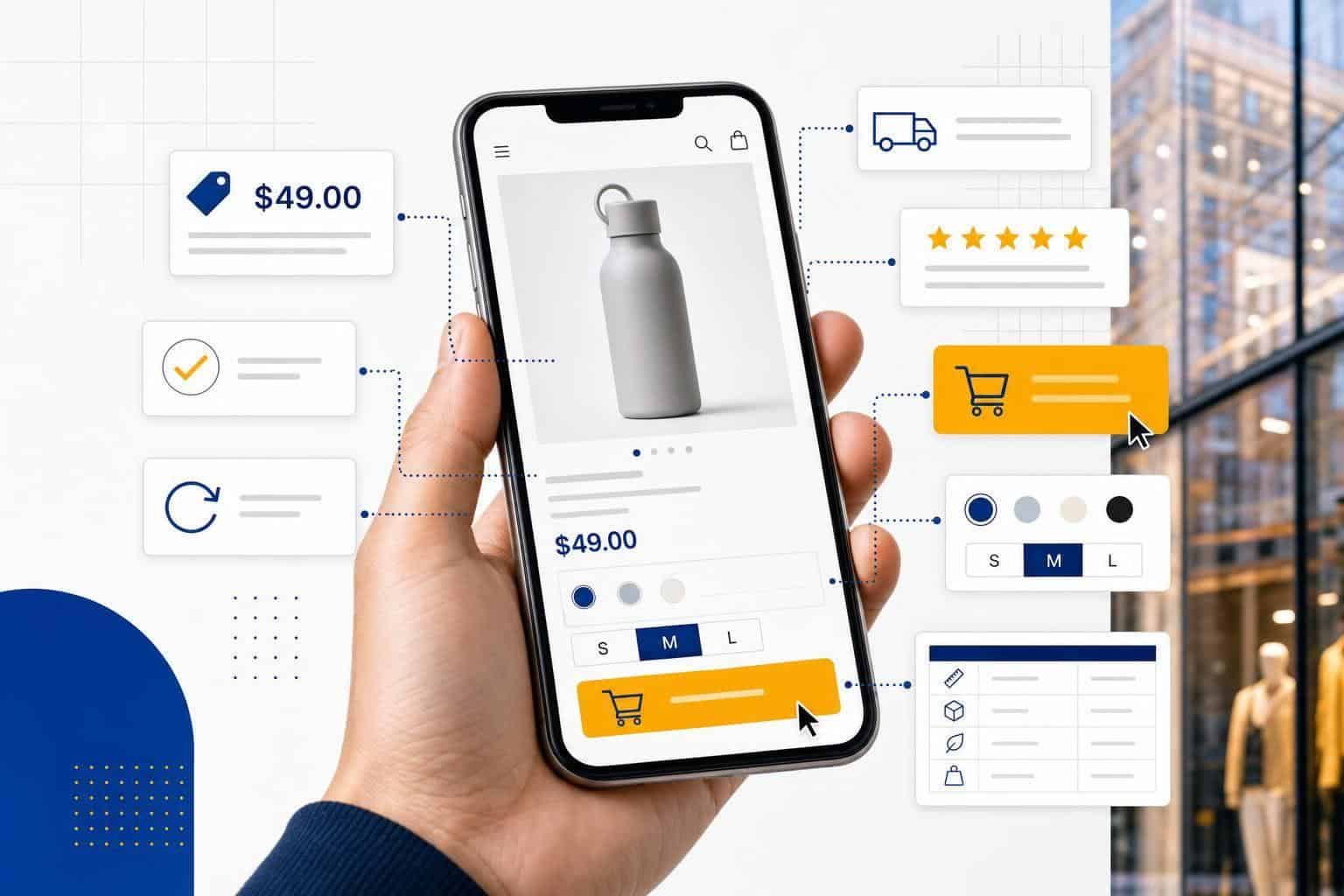
Put price, shipping, stock status, and return details right next to the Add to Cart button. That’s the part of the page people notice most when they’re deciding whether to buy.
Show shipping costs and return terms upfront. When people know the full deal before they add an item to the cart, you’re less likely to lose them later.
Good UX cuts friction at the buy decision. Next, use the eight tips below to make the page easier to scan, easier to trust, and easier to buy from.
1. Use Product Photos That Answer Shopper Questions
Your product photos should do the selling work before a shopper gets anywhere near Add to Cart. Use them to answer the big questions fast: fit, size, material, and key features.
That means adding close-up shots that show texture, stitching, finishes, and small details the main image doesn’t show. If you’re selling a sweater, show the knit. If you’re selling a bag, show the zipper, strap, and inside pockets.
Because over 70% of shoppers browse online stores on mobile devices, compress images without hurting image quality and serve them through a CDN – a content delivery network that helps images load faster from servers closer to the shopper [1][3].
Tip: After uploading new product photos, test the page on your phone, not just on desktop. Images that are too small are easy to miss on desktop but frustrate mobile shoppers [4][5].
Once your photos clear up visual doubt, move to the next friction point: price.
2. Make Pricing Clear and Transparent
Put the full price where people can see it right away. If you add fees late in checkout, many shoppers leave [2][3].
Keep the price next to the Add to Cart button. That makes the decision easier because shoppers don’t have to hunt for the number or scroll back up [3].
If there’s a discount, show both prices side by side. For example, show $49.00 and $39.00 together so the savings are obvious.
If the item renews, say that in plain English. Label it as a subscription or one-time purchase so no one has to guess [2].
Clear pricing builds trust and cuts hesitation. Next, make shipping just as plain.
3. Show Shipping Details Near the Buy Button
Put shipping cost and delivery timing right next to Add to Cart. That helps shoppers see the full cost before checkout, which cuts down on doubt and keeps them from digging through later steps just to find one number.
If you offer free shipping over a set amount, say exactly how much more they need to spend to get it. For example: "Spend $12 more to get free shipping." That gives people a clear next step instead of making them do the math.
On mobile, this matters even more. More than 70% of shoppers browse on phones, so shipping details need to stay visible and easy to scan on a small screen [3].
Once you’ve made shipping clear, move to the next friction point: stock status.
4. Add Reviews and Ratings as Social Proof
Put star ratings and review counts near the top of the page. The best spot is below the title or next to the price, because that’s where you’re already asking shoppers to make a buy call. Showing social proof there helps at the exact moment they’re weighing the product [3].
Start with the average rating and total review count. A line like 4.7 stars from 312 reviews works well because people can scan it in a second. Keep full written reviews lower on the page, then move shoppers toward stock status.
Use a third-party review platform if you can. Reviews from an outside source feel more believable than ratings shown only on your own site [6].
Next, make stock status easy to see.
5. Show Stock Status in Real Time
Put stock status right next to the Add to Cart button. If shoppers are ready to buy, they shouldn’t have to hunt for one last detail.
Use a plain In Stock label when an item is available. If inventory is low, say Only 3 left and turn on low-stock alerts so shoppers feel the pressure before the item sells out.
Show Out of Stock before anyone clicks Add to Cart. That saves frustration and cuts down on abandoned carts.
Keep your inventory synced in real time so the status stays accurate. If your store says an item is available and it isn’t, trust disappears fast.
Next, show return details before shoppers hesitate.
6. Show Return Information Early on the Page
Put a short return summary right next to the Add to Cart button. Shoppers make the buy decision there, so that’s where your return terms need to show up.
Use one clear line, like "Free 30-day returns on unused items." Keep it tight. Include only the return window, item condition, and how the return works.
Tip: Mobile shoppers miss footer links, so keep return terms visible on the page [3].
Clear return terms cut last-minute hesitation about fit or quality. If someone is on the fence, seeing 30-day returns on the product page can calm that doubt fast.
Don’t leave this only on your policy page. Show it on the product page too [3].
After that, make Add to Cart the obvious next click.
7. Make the Add-to-Cart Button Easy to Find
Put your Add to Cart button where people expect it: close to the price. When shoppers can see the price, shipping, stock, and returns, the next click should feel obvious.
Make the button hard to miss. Use a high-contrast color, keep the tap area large, and keep it visible as people scroll so it stays within reach on phones and desktops.
Once the main CTA is clear, you can show related products as a second option. Just don’t let them steal attention from the button you want people to click next.
8. Recommend Related Products Without Distracting Shoppers
Use related products to help the sale, not pull attention away from it.
Show a small set of add-ons, bundles, or frequently bought together items that match the product on the page. This works best when the suggestions feel obvious and useful, like a phone case for a phone or extra filters for a coffee machine.
Keep the module tied to live inventory so you never show items that are out of stock. That avoids dead ends and cuts down on shopper frustration.
Keep the list short: 3 to 4 items max. That gives people helpful options without turning the page into a second product grid, especially on mobile where space disappears fast.
The table below gives you a quick reference for all eight UX elements and where each one should sit on the page.
Quick Reference Table: 8 Product Page UX Elements
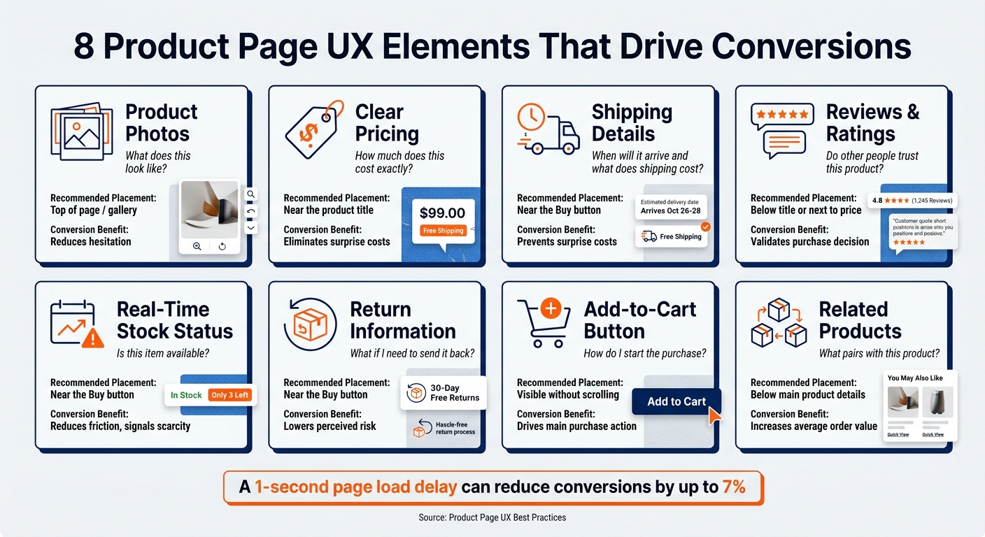
8 Product Page UX Elements That Drive Conversions
These eight page elements answer the questions shoppers ask right before they buy. Put them in the right spots, and you remove doubt, cut friction, and make the next click easy.
| UX Element | Shopper Question Answered | Placement | Conversion Benefit |
|---|---|---|---|
| Product Photos | What does this look like? | Top of page / gallery | Reduces hesitation |
| Clear Pricing | How much does this cost exactly? | Near the product title | Eliminates surprise costs |
| Shipping Details | When will it arrive and what does shipping cost? | Near the Buy button | Prevents surprise costs |
| Reviews & Ratings | Do other people trust this product? | Below the title or next to the price | Validates the purchase decision |
| Real-Time Stock Status | Is this item available? | Near the Buy button | Reduces friction and signals scarcity |
| Return Information | What if I need to send it back? | Near the Buy button | Lowers perceived risk |
| Add-to-Cart Button | How do I start the purchase? | Visible without scrolling | Drives the main purchase action |
| Related Products | What pairs with this product? | Below the main product details | Increases average order value |
Speed matters here. When shoppers can find these answers in a few seconds, they move toward checkout faster.
When those details are buried, missing, or fighting for attention, people pause. That pause is often where the sale slips away.
Common Product Page Mistakes to Avoid
The fix is simple: make the path to purchase feel clear and low-risk. The biggest blockers are hidden costs, fuzzy delivery timing, buried policy details, and weak trust signals.
Show shipping costs right next to Add to Cart. If you offer free shipping over a set amount, put that there too, such as Free shipping on orders over $50.
Delivery timing matters just as much. Use carrier-based estimates – shipping dates based on actual carrier data – so you can show an arrival window before checkout.
Put your return policy near Add to Cart in plain English. A short line like "30-day returns for unused items." works well because shoppers don’t want to hunt for basic policy details.
Reviews should be easy to spot. Show star ratings and customer photos under the product title so people get social proof early, not after they’ve already started doubting the purchase.
Keep the page focused on buying. If extra buttons, banners, and popups pull attention away from the main action, they make the page harder to use and easier to abandon.
Next, look at your product page above the fold and remove anything that doesn’t help someone say yes.
Conclusion
Your product page should make buying feel easy. Every detail either builds trust or gets in the way.
When shoppers can see the key facts early, they pause less and move with more confidence. Price, shipping, returns, reviews, and product details all need to show up fast and make sense at a glance.
These parts don’t work alone. They work together to cut friction right when someone is deciding whether to buy.
Speed matters just as much. If your mobile page loads slowly, you can still lose the sale even if the design looks good.
Don’t chase perfection. Start with the biggest friction points first, fix those, and then move to the next issue.
FAQs
What should I fix first on a product page?
Start by checking the numbers. Look at your conversion rate, traffic sources, and customer behavior so you can tell whether the whole product page is dragging down sales or if just a few parts need work.
That matters because the fix might be small. Maybe your photos are fine, but your shipping info is unclear. Maybe paid traffic from Google converts at 1.2%, while email traffic converts at 3.8%. That points you in a very different direction.
Next, rank fixes by what your business can handle right now. Focus on your budget, inventory needs, and any shipping or tax setup that makes changes harder or slower to roll out.
If you run your store yourself and don’t want to wrestle with the tech side, Turbify can make product page updates and store setup easier. That gives you a simpler way to make changes without getting stuck in the weeds.
How can I improve product page UX on mobile?
Prioritize mobile speed and responsive design first. If your site takes even 1 extra second to load, conversions can drop by about 7%, so your goal is simple: keep pages loading in under 2.5 seconds.
That means using compressed images so photos take up less space, minified code so your site files are smaller, and browser caching so returning visitors don’t have to reload everything from scratch. Those three fixes do a lot of the heavy lifting.
Your layout matters too. Keep your site structure clean, and make navigation easy to tap on a small screen. If people have to pinch, zoom, or hunt for a menu, they’ll leave.
If editing your mobile site feels like a headache, use an integrated platform like Turbify. It can make hosting, domains, and ecommerce easier to manage in one place, which saves time and cuts down on friction when you need to make updates.
Where should key buying details appear?
Key buying details like size, color, and other product options should show up on the product page or during checkout. That keeps shopping simple and cuts down on second-guessing before someone places an order.
If a shopper has to hunt for basic details, you risk losing the sale. Put those choices where people expect them, right next to the item or before payment.
If your store has more advanced needs, keep those details in one place inside your online store platform. That makes updates easier and helps you keep product info consistent across your site.
You should also show your return policy clearly and give customers an account portal where they can request returns. When people can see the rules and handle returns without sending emails back and forth, they tend to feel more at ease buying from you.