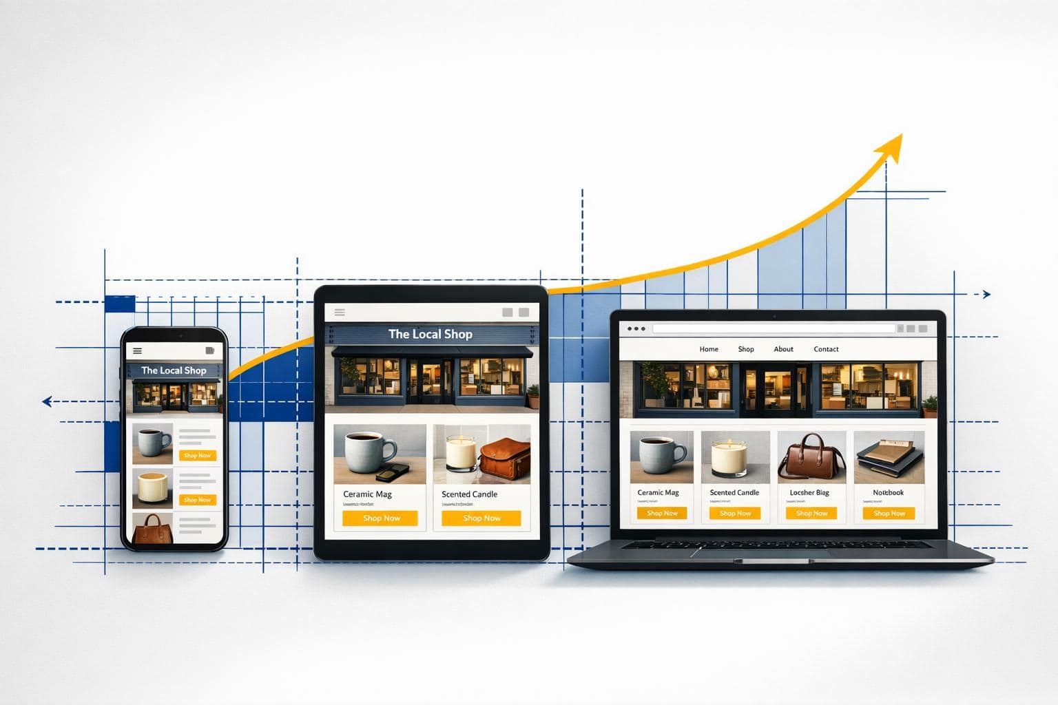
Responsive design makes your website work on any device – desktop, tablet, or phone – without frustrating your visitors. Over 60% of web traffic comes from mobile devices, and if your site isn’t ready for them, you risk losing customers fast. A responsive site adjusts automatically to screen size, ensuring everything looks and works right, no matter how someone visits.
Below, we’ll explain how responsive design works, why it’s critical for your business, and how to get started.
A practical guide to responsive web design
sbb-itb-7459f5e
What Is Responsive Design?
Responsive Web Design (RWD) is all about creating a single website that works smoothly across any device, whether it’s a phone, tablet, or desktop. Instead of building separate sites for mobile and desktop users, responsive design uses flexible layouts that adjust automatically to different screen sizes and orientations.
Vitaly Friedman, Editor-in-Chief of Smashing Magazine, puts it perfectly:
Responsive Web design is the approach that suggests that design and development should respond to the user’s behavior and environment based on screen size, platform and orientation. [1]
This is achieved with a few key techniques: fluid grids, which use percentages instead of fixed pixel widths; flexible images, which scale without exceeding their container’s size; and CSS media queries, which tweak the design based on device specifics.
One essential piece of the puzzle is the viewport meta tag: . This tells mobile browsers to display the site at the correct width for the device. Without it, mobile users might see a shrunken version of the desktop layout.
The result? A smooth, frustration-free experience. No more pinching, zooming, or scrolling sideways – content adjusts perfectly whether you’re on a 6.1-inch iPhone or a 27-inch desktop monitor. Let’s dive into the components that make responsive design work.
Key Elements of Responsive Design
To ensure your website looks great and works well on any device, you need three main building blocks for responsive design.
Fluid Grids and Layouts
Fluid grids ditch fixed pixel widths in favor of flexible, proportional measurements. For instance, instead of defining a sidebar as 300 pixels wide, you’d use percentages or modern CSS tools like Flexbox and CSS Grid. These grids divide your page into adaptable columns that adjust to different screen sizes [7].
With tools like Flexbox and CSS Grid, creating layouts that respond to available space becomes much easier. This means your website will hold its structure whether it’s viewed on a smartphone or a large desktop monitor [5].
Flexible Images and Media
Images need to resize smoothly to fit smaller screens without breaking your layout. The go-to CSS rule here is max-width: 100% and height: auto, which ensures images stay within their container’s width while keeping their original proportions [12][9].
For more control, use the srcset attribute to deliver the right image size for the right device [10][11]. For example, Retina displays can load high-resolution images, while smaller, less powerful devices can pull smaller files to save bandwidth.
When it comes to logos and icons, SVG files are the way to go. Unlike PNGs or JPEGs, SVGs are resolution-independent, so they stay sharp no matter the size [10][13].
Media Queries and Breakpoints
Media queries are CSS rules that kick in under specific conditions, like screen width. A breakpoint is the screen size where your layout changes to accommodate the available space [6][8].
For example, @media (min-width: 768px) { ... } applies styles only when the screen is at least 768 pixels wide. This "mobile-first" approach starts with styles for small screens and adds more as the screen size grows [6][8].
Here’s a quick overview of common breakpoints:
| Device Category | Screen Width | Common Breakpoint | Target Devices |
|---|---|---|---|
| Small (sm) | 576px and up | 576px | Mobile phones |
| Medium (md) | 768px and up | 768px | Tablets and small laptops |
| Large (lg) | 992px and up | 992px | Laptops and desktops |
| Extra Large (xl) | 1200px and up | 1200px | Large monitors |
Instead of tailoring your site to every possible device, focus on where your content naturally "breaks" or becomes harder to read [6][8]. A quick way to test this is by resizing your browser window. If the layout looks off, it’s time to adjust your breakpoints.
Why Your Website Needs Responsive Design
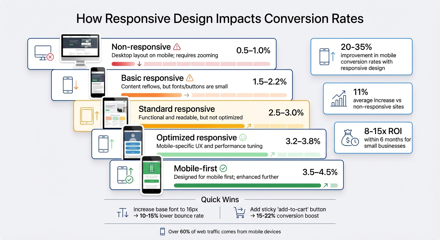
Mobile vs Desktop Conversion Rates by Responsive Design Level
Responsive design keeps your business competitive by ensuring your website works seamlessly on any device. With most web traffic now coming from smartphones and tablets [3], a site that adapts to all screen sizes is no longer optional – it’s essential.
Better User Experience Across Devices
A non-responsive site frustrates mobile users by forcing them to pinch, zoom, and scroll sideways. It’s no surprise that over 60% of mobile users leave sites that are slow or hard to navigate [14]. Responsive design solves this by automatically adjusting your website’s layout to fit any screen, from a small smartphone to a large desktop monitor.
The data is clear: mobile bounce rates average 40%, compared to 27% on tablets [2]. Worse, 57% of users who struggle with a poorly designed mobile site say they wouldn’t recommend the business [2]. This means lost customers and missed opportunities for word-of-mouth referrals. A responsive site not only keeps visitors engaged but also boosts your credibility with search engines.
Higher SEO Rankings with Mobile-First Indexing
Google’s mobile-first indexing, in place since 2015, prioritizes your mobile site when determining search rankings [4]. If your site isn’t mobile-friendly, you risk being outranked by competitors with responsive designs [4]. As Allie Decker from HubSpot explains:
Google’s mobile-first indexing can actually impact how your website ranks and can cause it to be bumped down on search engine results pages (SERPs) in favor of websites that offer consumers a mobile-friendly design.
Responsive design also simplifies things for search engines. A single URL for both mobile and desktop makes it easier for search bots to crawl and index your site [14]. Combined with lower bounce rates and longer session times – key ranking factors – a responsive design can significantly improve your visibility in search results.
More Conversions and Lower Bounce Rates
Responsive design isn’t just about aesthetics – it directly affects your revenue. Businesses with responsive sites see mobile conversion rates improve by 20-35%, with an average increase of 11% compared to non-responsive sites [15][16]. A well-optimized mobile experience can even double or triple your conversion rates [15].
For example, here’s how different design levels impact conversion rates:
| Design Level | Description | Typical Conversion Rate |
|---|---|---|
| Non-responsive | Desktop layout on mobile; requires zooming | 0.5–1.0% |
| Basic responsive | Content reflows, but fonts/buttons are small | 1.5–2.2% |
| Standard responsive | Functional and readable, but not optimized | 2.5–3.0% |
| Optimized responsive | Mobile-specific UX and performance tuning | 3.2–3.8% |
| Mobile-first | Designed for mobile first; enhanced further | 3.5–4.5% |
Simple tweaks can make a big difference. Increasing your base font size to 16px can cut bounce rates by 10-15%, while adding a sticky "add-to-cart" button on mobile can boost conversions by 15-22% [15]. Most small businesses recover their investment in responsive design within six months, often seeing an 8-15x return [15].
How to Implement Responsive Design
Creating a responsive website is more straightforward than ever, thanks to modern tools and techniques. You don’t need to start from scratch – these tools help you build layouts that adjust effortlessly to any screen size.
Here’s how you can put responsive design into action.
Use Frameworks Like Bootstrap
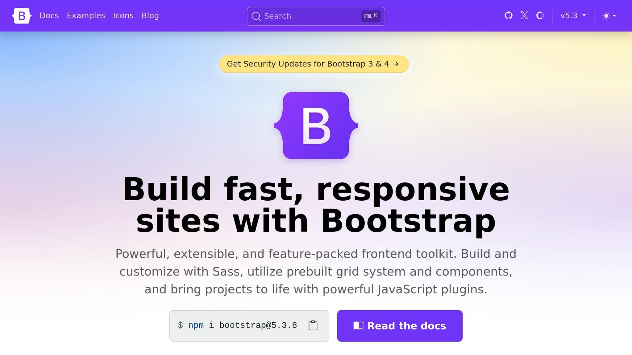
Bootstrap simplifies responsive design with pre-built components and a grid system that adapts to different screen sizes. Its 12-column grid, powered by Flexbox, resizes sections automatically. For example, a .col-4 class spans one-third of a row on desktop but stacks vertically on smaller screens using predefined responsive tiers [17][18].
Bootstrap also comes with six default breakpoints, ranging from extra small (under 576px for phones) to extra-extra large (1,400px and up for ultra-wide screens). Features like navigation bars even collapse into hamburger menus on smaller devices without needing custom code. You can quickly add Bootstrap via a CDN for prototyping or install it through npm for more advanced builds with Sass customization.
Don’t forget to include this meta tag in your HTML to ensure mobile browsers display your site correctly:
This tells mobile browsers to render your page at the device’s actual width instead of defaulting to 980px.
Use Flexbox and CSS Grid
Flexbox and CSS Grid are powerful CSS tools for creating responsive layouts without relying on frameworks. Flexbox is ideal for aligning items in a single row or column. For instance, applying flex: 1 to navigation links ensures they distribute evenly as the screen adjusts.
CSS Grid offers even more control over rows and columns. For example:
grid-template-columns: repeat(auto-fit, minmax(200px, 1fr)); This creates a card layout that wraps to new rows as the screen narrows, with the fr unit dividing space evenly.
To keep images and videos from breaking your layout, set max-width: 100% and height: auto. Use rem units for typography instead of pixels so text scales smoothly with user preferences.
Once your layout is in place, refine it by adding breakpoints tailored to your content.
Set Content-Based Breakpoints
Breakpoints should address where your design struggles – like when text gets cramped, images overflow, or navigation becomes awkward. As Rob O’Leary from LogRocket points out:
Instead of targeting fixed device widths, modern breakpoints focus on content-driven thresholds – points where the layout needs adjustment.
To find these thresholds, perform a “squish test” in your browser’s responsive design mode. Start with a narrow screen and slowly expand it, noting where your layout starts to feel off. Define your breakpoints at these points rather than sticking to standard device sizes.
For better scalability, use relative units like em or rem for breakpoints instead of fixed pixels. This approach ensures your design adapts to user settings and remains flexible for future devices.
How Turbify Makes Responsive Design Easy

Turbify takes the hard work out of creating a responsive website, letting you focus on growing your business instead of worrying about technical details. With responsive design being a must-have for modern websites, Turbify ensures your site works seamlessly across all devices.
Turbify No-Code Website Builder
Every hosting plan from Turbify comes with a no-code website builder that makes creating a responsive site a breeze. You can drag and drop elements like text, images, and buttons, and the builder automatically adjusts your design for mobile, tablet, and desktop views [19][20]. Plus, with over 100 templates included, you’ll have plenty of options to kick-start your design process [19].
This setup directly impacts your business by improving user experience and boosting conversion rates. For those who need a more tailored solution, Turbify offers a Professional Website Design package starting at $99.00/month, with a one-time build fee of $499.00 [21]. The design team follows a mobile-first approach and rigorously tests your site to ensure it performs perfectly on any device. As Turbify puts it:
Mobile-first approach ensures your site looks great on all devices [21].
All-in-One Hosting and Domain Services
Turbify simplifies website management by combining hosting, domain registration, business email, and SSL certificates into one easy-to-use dashboard. This consolidation not only saves time but also enhances security, with automatic SSL renewals and domain pointing handled for you [19][20].
Backed by a high-performance CloudLinux infrastructure, free SSL certificates, and a 99.99% uptime guarantee, Turbify ensures your site stays secure and accessible [20]. With over 25 years of experience and more than $80 billion in goods sold through its platform, Turbify knows what small businesses need [19]. Hosting plans start at just $2.99/month and include a free domain and SSL certificate [19].
Next Steps
Decide whether to create a brand-new responsive site or update your current one. If you’re starting from scratch, take a mobile-first approach – design for smartphones first and then expand for larger screens. For existing websites, use Google’s Mobile-Friendly Test to pinpoint any immediate problems.
To simplify the process and avoid potential headaches, you might want to check out Turbify’s hosting plans. These include a no-code website builder with responsive templates that automatically adapt to mobile, tablet, and desktop screens. If you need something more tailored, their Professional Website Design package can provide custom solutions.
If you’re more of a hands-on person, here’s how to tackle it yourself. Start by adding this viewport meta tag to your HTML:
This ensures your website adjusts properly for different screen sizes. Next, use flexible layouts with tools like CSS Grid or Flexbox, and make sure your images scale by applying max-width: 100% in your CSS. These steps will help your site look great on any device.
FAQs
How can I tell if my site is responsive?
A responsive website adjusts itself seamlessly to different screen sizes, whether it’s viewed on a desktop, tablet, or smartphone. To test this, try resizing your browser window – does the layout adapt as the window gets smaller? You can also check by opening your site on various devices.
A properly responsive site ensures that images resize proportionally, text remains easy to read, and users don’t need to zoom or scroll horizontally. If things look awkward or require extra effort to navigate, your site likely needs some work to improve its responsiveness.
What breakpoints should I use for my website?
Breakpoints are the screen widths where your website layout adjusts to fit different devices. The best ones to use depend on both common device sizes and the specific needs of your content. Here are some typical breakpoints:
- XS (Extra Small): 0 px – for small phones
- SM (Small): 576 px – for standard phones
- MD (Medium): 768 px – for large phones and small tablets
- LG (Large): 992 px – for tablets and small laptops
- XL (Extra Large): 1200 px – for desktops
Stick to a mobile-first approach, meaning you design for smaller screens first and then scale up for larger ones. Aim to pick 3–5 breakpoints based on actual data about the devices your audience uses most. This keeps your site functional and user-friendly across all screen sizes.
Will responsive design slow down my site?
Responsive design, when implemented well, won’t slow your site down. In fact, it can make your site faster by tailoring content to fit different devices efficiently. But if it’s done poorly, it can cause delays and hurt performance.
To get it right, prioritize proper execution and thorough testing. This ensures your site works seamlessly across all devices without sacrificing speed.


